Ross Knight at Team Gallery, New York, NY
by Tom Moody
("Author's cut" of a review originally published in Artforum, April 1999.)

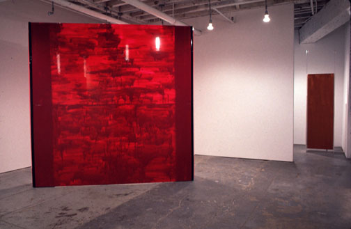
Ross Knight's recent exhibition drew on influences spanning the socioeconomic spectrum: the emptied-out, less-is-more design of a tony, Minimalist-inspired loft; the lightweight, portable architecture of the corporate trade show; and the sloppy, catch-as-catch-can facture of the homeless encampment. The artist's boxy, maquette-like constructions of corrugated vinyl sheeting, held together with Velcro or fastened onto armatures of aluminum piping, come in an array of basic shapes--rectangular solids, vertical planes, a prism standing on edge--all assembled as crudely as possible and adorned with slapped-on coats of paint.
Although the entire show could be taken apart and stowed in the back of a minivan, the sculptures had a monumental presence that greatly changed the look and feel of the gallery. As you moved around the leaning, wobbly constructions, you gradually became aware of a wealth of amusing, even nonsensical architectural details--misplaced screw holes, Velcro protruding from seams, edges that might have been cut by a fourth-grader. Be Something (all works 1998) looks like a miniature office cubicle, but closer inspection reveals an object that's little more than the sum of its dysfunctions: an impenetrable enclosure with transparent corner moldings extending toward the ceiling like hookless coatracks on a luncheonette booth, metal piping that serves no load-bearing function, and a gap near the floor that designers call "toe clearance" (a small space at the bottom of a desk or cabinet used to create a sense of openness), installed where no one would likely be sitting or standing. Yet for all their incongruities, the sculptures manage to connote a variety of uses that seem to change depending on one's angle of view. On one side of the exhibition invite, photographed in front of the Manhattan skyline, a U-shaped structure titled Thru takes on characteristics of the background so that it resembles a high school stage set of "the city"; on the flip side of the card, Thru appears seen from behind, this time looking like a booth that's been lugged to one too many street fairs, with a homeless man who wandered into the photo shoot standing next to it like a carnival barker. In the exhibition itself, plopped awkwardly at the entrance to the gallery (and virtually unrecognizable as the piece on the invite), the work, painted a warm, engulfing yellow, served as a rickety corridor into the space.
The paint on these sculptures, applied directly to the vinyl in streaked or drippy coats, might have been a distracting frill to a hard-core Minimalist like Donald Judd; in the '90s the phenomenological investigation of objects has loosened to allow the occasional indulgence in juicy surface. Sometimes color adds an element of surprise: Your Name, a drooping, pulpit-shaped construction, has an outer coat of streaked metallic silver and an inner one of retina-popping turquoise that is initially hidden from view. After discovering the dramatic splash of color, you couldn't help but notice its reflection on the floor and nearby walls. Other times the use of paint reminded viewers of the workaday world. Slathered with translucent violet and propped up (as if to dry) on makeshift columns of folded vinyl, Nice Job is a towering, movable wall painted with the kind of unconscious panache that one sometimes notices on provisional structures in subway stations. The combination of violet wall, lighter magenta columns, and sturdy black trim was a stunning homage to the "found" abstractions we often encounter outside the gallery walls.
