more new romantics

new_romantics_stars_crop

It's not sporting to criticize an exhibition in advance, without seeing it, based on the premise alone, unless it's called The New Romantics and you like some of the artists and shudder to see them branded that way. Hence the present upchucks of sarcasm.

Of the following only three can be held accountable for the newromanticization of their work, and those are the ones who organized the show (in bold): Mark Beasley, Tim Berrensheim, Alexandra Gorczynski, Ryan Whittier Hale, Claudia Hart, Jeremiah Johnson, Brookhart Jonquil, Sophie Kahn, Alex M. Lee, Sara Ludy, Shane Mecklenburger, Jonathan Monaghan, Mikey McParlane and Michael Mallis, Brenna Murphy, Nicholas O’Brien, Jaakko Pallasvuo, Jon Rafman, Nicolas Sassoon, Jasper Spicero, Kate Steciw, Katie Torn, Krist Wood, ATOM-r (Mark Jeffrey and Judd Morrissey), Zach Blas, Ann Hirsch, Miao Jiaxin, Mikey McParlane, and Vincent Tiley.

Will the show convince us that any of the artists are participating in the tradition of Kaspar David Friedrich, Wagner, The Arts and Crafts Movement, Gary Numan, and "Bela Lugosi's Dead?" Do we need to be reassured that this or that chiptune musician or Google Street View appropriator is actually working in the Romantic tradition? Can anyone making art, music, and videos with Apple products ever truly be called romantic, given what we know about Steve Jobs and Foxconn's dark Satanic mills? (Microsoft users are automatically disqualified. But what about Linux -- can a nerd be romantic?) Is a cyberpunk author romantic, or a realist about present conditions? Are glitch artists romantic merely because they dismantle? Are we talking here about romantic in the sense of "feeling romantic when you sip coffee and talk to the barrista at Starbucks"? If not, why not?

hat tip Jules Laplace, a romantic fellow, for the coffee GIF that paired so well with Eyebeam's New Romantics logo.
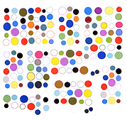
new romantics, go back to the graveyard

new_romantic

When you think of "new romantics" and "internet" the first thing that probably comes to mind is goth girls posing in cemeteries.
Possibly that wasn't the first thing that popped into the heads of the curators of Eyebeam's upcoming exhibit with the unapologetic title, The New Romantics. "Just as the Romantics responded to the industrial revolution," the curators postulate, "this group of artists are similarly responding to the current information revolution."
Ever since William Gibson envisioned Haitian voodoo spirits inhabiting cyberspace, writers have been trying to depict computers and the internet as something other than what they are: soulless cold environments created by nerds to be inhabited by other nerds. The internet is the domain of numbers, statistics, menus, and multiple choice tests. The only way to imagine it otherwise might be something like David Cronenberg's fleshy "game pods" that attach to your spine with an umbilical: a "dream space out of meat space" governed by murky synaptical potentials rather than precise silicon robotics. In the real cyberspace we inhabit, however, no amount of pouty romantic acting out can overcome that it's going to be converted to pixels and aiff files and reproduced on a page where it will be tabulated with like counts and stored with thousands of other similar expressions.

my new romantic drawing above was made with the Computers Club Drawing Society "Chibi Paint" software (and resized to fit here)

The New Conformists, at Eyebeam

After finally seeing "The New Romantics" show at Eyebeam (a closing reception was last night) I read Paddy Johnson's Artnet interview with Nicholas O'Brien, one of the three curators. Her questions drip with understandable skepticism and the answers are not satisfactory. Johnson asked if technology was making us lose our sense of awe, and O'Brien replied with an observation about his college-level digital art students:

They not only feel overwhelmed by access to our history, but I think they are overwhelmed by the amount of things that need to be considered and the amount of things that should be considered when being a responsible artist in the 21st century.

"Responsible artist in the 21st century" -- there's the problem right there. Can you be a romantic and be that? It suggests a better title and concept for the show than "The New Romantics." This is a show of up-and-coming new media artists who aren't overwhelmed by choice, aren't opposed to using the tools and algorithms of consumer society they're told they must use to exist responsibly in the modern world (Apple computers, Samsung screens, 3D printers), and are all looking for validation within an academic system that expects them to work and teach responsibly. Ladies and gentlemen, I give you The New Conformists.

Some of the work was good and would have been better if viewed through a non-Romantic lens. I particularly enjoyed Jonathan Monaghan's baroque decoration flying apart and slowly drifting through a virtual cubicle environment, Krist Wood's collection of physics-modeling demos by one- or two-time users culled from YouTube and elsewhere, Katie Torn's Tanguy-esque collages, and other non-romantic works.

Completely missing from the show was the lo-fi or DIY trend in new media that's as close as the field gets to a Romantic impulse, in the sense of the Arts & Crafts Movement's response to industrialization or William Blake's contention that Isaac Newton killed the cosmos. This rebel, self-help tendency has been manifested in the past with the Bent Festival (circuit bending), Blipfest (chiptunes made with "obsolete" gear) or anyone trying to make their own computers or an alternate, non-corporate/government Internet. At Eyebeam it was Apple gear as far as the eye could see. Sorry, Steve Jobs was not romantic.

More

new romantic meaning not romantic

sara_ludy_transom

Knowing that Sara Ludy has been included in Eyebeam's upcoming The New Romantics exhibition, let's take a look at her website. This work is romantic in the sense that Mies Van Der Rohe, Lionel Feininger, Gerhard Richter, and David Cronenberg are romantic, which is to say, it's not romantic at all. If anything, the work turns a clinical and classical eye on clichés of romanticism: open, airy spaces, model communities in the exurbs, travels through psychedelic inner worlds. The persistent vibe is one of authorial distance and analysis: even the found internet junk, such as 3D advertising from the retail and real estate sectors, has a calm, measured feel. This could be construed as "new romantic" only if the term "new" means "anti-" or "not."

A couple of examples. Ludy describes Pan GIFs as "a series of animated gifs displayed as tiled backgrounds. Each gif is composed of two photographs that alternate with a linear transition, creating a repetition which both embraces and attempts to break the mundanity of everyday landscapes and architectures." By means of a simple, sweeping left-to-right pan one photo gradually eclipses a second, different-angle view of the same subject (a forest, a wall with cast shadow, a plant in a planter). While the scan is occurring a clear reading of both images breaks down. Because the GIF is "tiled" the scanning movement repeats across the entire screen, providing a view rather like an insect's compound eye. This causes a single predominant color or texture momentarily to colonize the screen. The lurch into a de-familiarizing zone of pure form is a classical technique, even though the underlying images may be romantic ones of gardens and hillsides. But even the disrupted tropes aren't that romantic: they seem to have been chosen for a vibe of sterile alienation.

Or consider the 2011 video Transom: "a space portrait of Market Station in Leesburg, VA," where "historic buildings were uprooted and relocated to form [a] commercial complex in the 1980s." Instead of the usual tear-downs of historic structures to make way for a new office/retail complex, the Leesburg project rehabbed some old buildings and moved them to the complex, so that "a railroad freight station, a log house, two barns and two gristmills" (per Wikipedia) can now lead a zombie existence as the site of "high-tech and legal offices, retail shops, and restaurants." Ludy's virtual walk-through of the vintage architecture strips out its real-world textures, reducing it to the cold, angled planes of 3D modeling. Like the Pan GIFs, a series of slow wipes prevents our getting any real sense of the physical presence of these "old time" buildings. The drone-y background sounds make this feel like a tour of Chamber of Commerce hell. Visually seductive, severe, cerebral, the work comments on a romantic ideal of a vanishing America rather than embodying it.

thoughts on Grant Wood

Grant-Wood-March-MFAH-600x446

Grant Wood, March, 1940, charcoal on wove paper

In the Texas visual arts magazine Glasstire, former publisher Rainey Knudson considers the above drawing, owned by the Museum of Fine Arts, Houston. Her essay, "Do Art Critics Need to Know How Sausage Is Made?" has two parts. In the first, she describes her experience of going back to school, after many years as a professional art writer. She tells us what she learned in a college-level drawing course, and how it changed her perceptions about artworks. (1) In the second part she critiques the Wood drawing, as a kind of test of these perceptions. Employing a series of close-up photos, she discusses the artist's techniques (crosshatching, erasure, etc.) and how they give interest to the work.

She doesn't really cover the content of the drawing, however. She says a "picture of a country road disappearing into a landscape" could be "sappy" if not for the "energy and movement" of certain marks, and the artist's intuitive handling of texture, but that's about it.

I haven't seen this drawing in person so this is a "jpeg review," take it for what it's worth.

Grant Wood is known for his stiff, iconic portraits of rural Midwestern subjects, American Gothic being the most famous. Perceived as a slightly bohemian "character" in his native Cedar Rapids, Iowa, he was nonetheless a staunch regionalist, and famously wore farmer's overalls to make the point. He had taken several trips to Europe in the 1910s and 1920s but remained mostly unaffected by Modernist art movements in his early career. He had absorbed some of the "arts and crafts" thinking of fin de siècle Romantics but resisted the more extreme lessons of Cubism, Surrealism, and pure abstraction. (2)

In the populist 1930s his regionalist vision was celebrated but near the end of his life, when this drawing was done (he died two years later), a backlash against his type of art was in full swing. He fought bitterly with members of his own university art department, who saw him as a self-promoting hack and has-been. After several years of glowing press, his reputation was starting to slip. Publicly he continued to fight for the regionalist vision, but privately he was vexed by the criticism, and strove to make his last works more abstract and Modernistic, incorporating rhythmic patterns and geometric compositions. (3)

wood_march_litho650w

The lithograph version of March (above), belongs to these late semi-abstracts but is fairly calm and composed, at least from what I can see from a jpeg. Even as a digital reproduction, the drawing version that Knudson reviews (seen at the top of the post) feels more dynamic. A simple country road winding through bald hills becomes a jagged slash of movement. Strong gusts of wind blow from left to right while afternoon sunlight beams in the opposite direction. The crosshatched hills seem to throb and undulate. All this movement is even clearer in the detail posted by Knudson:


Grant-Wood-March-MFAH-detail-2-600x404

Grant Wood, March, 1940, charcoal on wove paper (detail)


There's a well-known tendency for artists to tighten up when making formal "permanent" statements such as paintings but to be carefree and honest when drawing. Perhaps that's what happened here. Pure speculation, but this may be more of a reflection of Wood's emotional state at the time than the more polished, lithographic version of the same image. ("They say I'm not modern -- slash slash with the eraser -- I'll show them!" might be his thought balloon as he worked on this.)

Wood's angular hatching and patterning recalls Cubism's folds and involutions, or some crazy Futurist cityscape. Yet instead of explosive urban traffic there is only a lone horse pulling a carriage. It's as if Wood wanted to depict a calm America, a place of rural, nostalgic refuge, while at the same time channeling The Vortex. His slightly superhuman, illustrator-confident hand facility perfectly balances aggression and control, giving us not so much a drawing as a map of unresolved doctrinal tensions.

Despite the patriotism of World War II era, American culture was changing around this time. Fleeing the war, European artists moved here and brought international art attitudes with them. (4) New York became a world art capital, cosmopolitanism became the norm, and "regions" became objects of anthropological study rather than sources of inspiration. Wood's small town conservatism, already beginning to be an issue in the 1940s, would certainly kill his chances of acceptance today in the world of museum installations and international art fairs. Were he making this work now he would be doomed to remain cordoned off in the "other art world" of people who collect Remingtons.

Even though drawing is perceived as more ephemeral than painting (still) among curators and collectors, it's nevertheless an act of freezing time and fixing history, in comparison to digital art products, which can be manipulated in endless ways. The idea of creating a timeless, stand-alone artifact seems quaint now but in Wood's time what went down on the paper had to count -- that's what art was. This may explain the level of verve and commitment that can still be perceived even in a series of jpeg details, long after battles over "regionalism" have dwindled down to nothing.

1. In the comments to the Glasstire essay, an artist complains that Knudson's years of pre-art class criticism were "like expecting someone who has never even held a screw driver to be able to tell me how to fix my car." Like Marshall McLuhan coming out from behind the theatre sign in Annie Hall, ex-Newsweek critic Peter Plagens suddenly appears in the thread and responds: "Old saying: You don’t have to be a chicken to know a rotten egg... Art writers and curators aren’t trying to tell you how to fix your car (metaphorically, how to make art). They’re judging your art -- something that viewers do, in writing or not, all the time... Betcha when the judgment is along the lines of, 'Hey, that’s a great piece of art you made!' you don’t complain about being judged."

2. Wanda M. Corn, Grant Wood: The Regionalist Vision, Yale University Press, 1983

3. Id.

4. Id.