interview re: GIFs and internet art (as of 2021)

I was recently interviewed by Bia Santarosa, Victor Musso and Leo Zenun, students at ESPM São Paulo, for their final paper on the topic of animated GIFs and "minimal communication." This Q&A gave me an opportunity to update some of my thinking about GIFs in my own work, so with their permission I'm reproducing it here.

When did you become interested in art? What's your trajectory been like?

I’ve made art since childhood and published cartoons in my high school newspaper. In college I double-majored in art and English literature and after graduating I continued my studies at the Corcoran School of Art in Washington DC and School of Visual Arts in NY. I opted not to pursue an MFA since I had little interest in teaching. I began showing my paintings at a cooperative gallery in Dallas, Texas and eventually moved to commercial galleries in NY and elsewhere. Mine has always been a “fine art” practice, as opposed to illustration or graphic design.

When did you start making gifs?

I started making animated .gifs in 2003. At that point they were already considered “retro” (an art form associated with the ‘90s and the dot com era). I was interested in their potential as an art form combining painting and film.

Also, do you have an opinion about net art and its history? How did image archives begin being spread, for instance, and what’s the interest around it?

The history of net art is very tied to tech developments and changes. Thus you had solo, self-hosted sites in the ‘90s, blog-based sites in the ‘00s (still mostly self-hosted), then beginning in the mid-2000s, the rise of aggregators (Flickr, delic.io.us, tumblr) and eventually the full-blown, monopoly-owned social media we have now. Each change required an adjustment in people’s ideas of art, or what was the “right” kind of art for the respective platform. For example, .gifs went from simple graphic elements in the ‘90s to stand-alone art in the ‘00s (which could be passed from site to site) to a meme craze in the late ‘00s/early ‘10s where “gif” became synonymous with “short repeating popular movie clip.” What started (certainly in my case) as a renegade art practice became tamed and appropriated by corporate social media, so that now many “gifs” aren’t actually .gif files, but are looping .mp4 videos (Twitter even pastes the word “GIF” on these non-.gif files).

What relationship do you see between gif and art, and art and minimalism?

Aesthetically I was certainly interested in the simplicity and low frame rate of animated .gifs. These were succinct “art statements” that any browser could read and didn’t require proprietary players to activate. In the early ‘00s the main way of presenting video was clumsy “Flash” players that had to be embedded in the page, unlike .gifs, which began playing immediately in the browser when loaded. With the complete dominance of “social” the context has changed and the “gif style” has been reincorporated as another form of video. Video players have gotten more universal and less cumbersome as bandwidth has increased. Many of my peers from the renegade .gif days are quite comfortable having Twitter convert their efforts into .mp4 videos now – something I’m not particularly interested in.

Do you have a target audience?

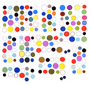
My target audience is the art world and it was interesting how animated .gifs leapt outside that frame because they were so easily transmissible. By the mid-’00s I was accustomed to seeing my minimal, abstract artworks being used as eye candy on people’s Livejournal and YouTube pages (early YouTube pages were more customizable and allowed tiled animation backgrounds).

Have you done any jobs for a label?

No, my work has stayed in the fine art context. Sold in galleries as prints or editioned DVDs.

Considering that nowadays people have been paying less and less attention to everything (Economy of Attention), what do you think is the role of gifs in Art?

As stated above, .gifs have been largely subsumed into corporate culture and no longer function as a rogue element being passed from person to person outside these networks, or sold in galleries as fine art. There was a brief flurry of interest in “animated GIFs as art” but I think that’s died down. I am not conversant enough with the recent “NFT art” craze to know whether “gifs” are being offered for sale as .gif files, or whether they are just a style or flavor of video art moving in the blockchain context. My guess is the tech buyers don’t care much about these distinctions, or other art historical considerations – they are more interested in how technology confers ownership.

Is there any social media that enhances your work? (Whether by the public present on it or by its format)

I was an early adopter of the blog format, beginning in 2001. I participated in several group blogs run by like-minded artists throughout the 2000s. These predated Tumblr, a corporate-run social media site that incorporated ideas of blogging and reblogging and attracted many artists. I never joined Tumblr, preferring my “old school blogging” approach.
In 2010 the artist Ryder Ripps and others created dump.fm, which was a meme-type site built around IRC (Internet Relay Chat). Dump was basically a ‘90s, AOL-style chat room but with the ability to post images or groups of images. I was very active there until it shut down in 2016 and I have continued to be involved with IRC communities.
I was active on Twitter from 2008 to 2018, but only for text and writing – once the site added images and video (and advertisements) I lost interest.
The mid-2010s saw a mass migration of the art world to Instagram. Again, something I avoided, not wanting to have involvement with any Mark Zuckerberg project.

What's your creative process? Do you follow specific formulas or are you usually taken by sensibility? What are your inspirations?

I’m working on several fronts: digital painting (in the form of image files and ink jet prints), animation and video, and music. There is some crossover of these interests but mostly I keep them separate. I am inspired by the whole range of cultural production, from fine art to commercial to outsider.
Kodwo Eshun on abstraction

Found a PDF of Christopher Cox's 2014 interview with writer Kodwo Eshun, making a case for a hermetic practice, despite the current art world's hatred of abstraction lacking in obvious identity signifiers. Excerpts are below.

Christopher Cox: Yet you clearly don’t aim to wrap it all up neatly. As you mentioned earlier, there’s a hermetic -- even mystical -- tendency in your work that resists decoding and competes with the hermeneutic tendency to fully understand or “unzip.”

Kodwo Eshun: Yeah, the sense of initiation, the sense that the work is initiating you into an enigma so that you become something like a disciple. So, there is something occult.

CC: Not just a reader or interpreter, but a disciple?

KE: Yes. You become part of it, which implies that you’re won over by it and that you too will go out and somehow proselytize on behalf of the work and carry it with you so that you’re now a kind of card-carrying disciple of this enigmatic experience that you’ve had. You haven’t decoded it. You’ve accepted that you can’t decode it and you’ve enjoyed that process will take it with you. This initiation is something I really enjoy. Certain kinds of audiovisual experiences are really good at doing that. Certain kinds of films have this capacity to turn you into disciples of them; and this is also the strongest feeling of Drexciyan music itself. So, there’s a kind of affirmative dimension to mystification. “Mystification” sounds obfuscatory, like you’re mystifying for the sake of it. But I’m interested in “mystification” in the sense of what Marshall McLuhan calls“participation mystique.” [The phrase is originally from Lucien Lévy-Bruhl, How Natives Think (1910), trans. Lilian A. Clare (London: Allen & Unwin, 1926).] If an artistic experience is really working, it’s working through this level of you finding yourself participating in a mystery without quite realizing how you got there. The music I love has that dimension.

CC: It has to solicit you, in a way.

And more:

Kodwo Eshun: There’s a curator in the States, Valerie Cassel Oliver, who’s been excavating African-American abstraction. It’s not that it was buried, but for different reasons, certain abstractionists perennially complicate an easy read. Whether it’s Norman Lewis or Fred Eversley, these figures are not racially readable. That’s all it takes. As soon as the work throws up a dimension of optical fugitivity, in other words, as soon as the work cannot immediately be read as belonging to what people recognize is African-American legibility, then suddenly it disappears, whereas actually it is exactly that work that is most compelling precisely because it blocks legibility so you can’t easily read it in terms of the identity of the person who is making it. You have to do more work. You have to think of all the other things that the work might be about, as well as the identity of the artist. So, with people like Charles Gaines, the African-American Fluxus artist Benjamin Patterson, all these artists, the complexity of their work is not an easy read. So, they tend not to be named when we talk about Afrofuturism. But actually, if they’re not Afrofuturists, I don’t know who is.

new page: selected critical writing

I've added a new page to my blog sidebar (the thing that appears at the bottom of the page on a phone) called Selected Critical Writing.
Actually it's an older page from my Digital Media Tree days that I've been updating. Several new pages have been added, linked from that one. The contents are:

Selected writing for print publications:

• "Paradise/Paradox," Sculpture, March 2004, pp 71-72 [image and text]

• "Palo Alto Dreamin': Towards a New Digital Expression(ism)," Art Papers, November/December 2001, pp 20-24 [images and text]

• "Compression" at Feigen Contemporary, Art Papers, May/June 2001 [text]

• noto (Carsten Nicolai): "The Trouble Is (Not) With Your Set" VERY No. 8, October 2000 [image and text]

• Michael Rodriguez, Miami-Dade Community College, catalog essay, June/July 2000 [images and text]

• "Secondary Structures": Rachel Harrison, Ross Knight, Michael Phelan, Sculpture Magazine, June 2000 [PDF] [text] [link]

• "Laura Parnes and Sue de Beer: Double Your Transgression, Double Your Fun," VERY, Fall 1999 [text] [link]

• Nina Katchadourian at Debs & Co., New York, NY Artforum, Summer 1999 [image and text]

• Ross Knight at Team Gallery, New York, NY Artforum, April 1999 [image and text]

• Drew Dominick at Jose Freire, New York, NY, New Art Examiner, February 1996 [images and text]

• Jack Featherly at Team Gallery, catalog essay, March 2002 [images and text]

Curated exhibitions:

• Perry House at Gray Matters, Dallas, Texas, October 1993 [images] [PDF of essay]

• "Thread" exhibition catalog, Cristinerose Gallery, New York, NY, September 4 - October 4, 1997 [images and text]

Web-only (self-published):

• "One Hour Photo: Portrait of an Artist," 2002 [image and text]

• "Video Games and Contemporary Sculpture," 2002 [images and text]

Interviews:

• jenghizkhan [click here]

• Jack Featherly [click here]

• Doris Piserchia (with Joanna Pataki) [click here]

from the vault: "Tom Moody's BLOG," by Palo Fabus

UK-based Furtherfield.org, an artist-led online community, arts organization and online magazine, gave me a very supportive review back in the '00s, written by Palo Fabus. The page recently got a stylistic makeover. I greatly appreciate that Furtherfield is committed to older content from the pre-social media days, unlike certain publications that weaseled out and abandoned their work to the Wayback Machine.

from the vault: Video Games and Contemporary Sculpture

Am (still) gradually moving content from my old Digital Media Tree website over to tommoody.us, including an index of published writing examples. I wrote the essay below in 2002 as a self-hosted web-publication. Not sure how well the funky image alignment HTML will work with modern devices but I'll keep it for now.

Product design doesn't emerge in a vacuum; it's part of a larger visual history, reflecting developments in technology, fabrication technique, and philosophy that also apply to the purer arts. Before the late '60s, when the scientific pretensions of the high modernist era began to break down, art and design seemed to move in easy parallel, influencing or being influenced by one other. Yet since that time, with the exception of the occasional visionary (or quasi-visionary oddball such as Matthew Barney), art has preferred to take itself out of the equation, offering ironic footnotes and meta-commentary rather than design per se.

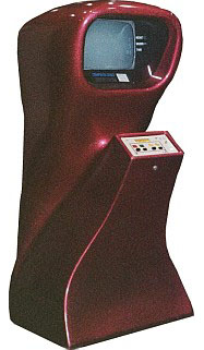
For an example of a commercial object planted firmly in the modernist feedback loop, let's consider Nutting Associates' Computer Space game (1971). The first arcade-style game is clearly rooted in the space age design of the late '60s and early '70s. Its body is made of Fiberglas, one of the "new materials" that promised to revolutionize how we live, work, and shop: tough but malleable, able to be molded into pleasing, biomorphic contours, as in the Eames chair and the Corvette Stingray body. Combining the abstract curves of a Henry Moore sculpture with Apollo-era push-buttons and screen technology, Computer Space is delightfully anthropomorphic, with a bulbous head and pseudopod arm proffering its control panel like a robot butler. Typical of science fiction's use of present-day kitsch objects as futuristic props (e.g, the design-store salt shakers as medical instruments in the McCoy-era Star Trek), Computer Space appeared briefly onscreen in the 1973 Charlton Heston vehicle Soylent Green--as a game, however, rather than a piece of newfangled equipment.

Many artists of the '60s, such as George Rickey and Kenneth Snelson, made objects with the same buoyant optimism and faith in science one sees in the contours of Computer Space. Some of Canadian sculptor Walter Redinger's Fiberglas sculptures fit right in with the NASA aesthetic, while others begin to break away from the upbeat positivism of the '60s and explore its dark side. An untitled wall-piece from 1969, featuring a bizarre, quasi-fetal shape spewing out of the placid surface of a large monochrome triptych, belongs to the latter group. In Redinger's late-'60s-style rhetoric, this phallic-vaginal wraith reflects "the tension which exists between organic and geometric forms," but in retrospect it reads more as a tumorous growth on the picture plane--as if the bodily repression of the Formalist tradition were taking pathological form.

By the '80s, artists had left the design world to fend for itself as they went off to explore the outer reaches of French theory, identity politics, and institutional critique. During this period, video games became functional, box-like, and festooned with tacky graphics: the Xevious game, 1983, for example, featured epic battles of Star Wars-style space ships painted on its sides. The shapes of the consoles may have been utilitarian and ordinary, but the games were popular, thus providing a visual meme that could later be recycled within the art world's self-referential feedback-eddy.

Thus, in Rita McBride’s Machines, 2000, the shapes of "various standard video game consoles found in arcades and neglected bars around the world" (to quote the gallery press release) are presented stripped of all signage and hardware. Made of mass-produced vitreous enamel typically used for industrial signage and subways, the sculptures combine the comforting hues and textures of '50s refrigerators with shapes invoking the design-challenged, shopping-mall '80s. Unlike Redinger's work, however, which was to some extent participating in the grand experiment of its age, McBride's exists at a critical remove from the design world's cycles of innovation and cliche. It comments on the underlying social assumptions of objects without putting too much at risk. That's fine for now, but eventually we may get hungry to see a lava lamp again, as opposed to a "lava lamp."

Photos, top to bottom:
Computer Space arcade game (Nutting Associates), 1971
Walter Redinger, Untitled, 1969, Fiberglas
Xevious arcade game (Atari), 1982
Rita McBride, Machines, 2000