retro computer art and the aesthetic of the shift: 2. Marc Augé

A previous post discussed artists' use of the "just-past" to question the eternal new of Western commodity culture ("where there is always the new and it is always superseded by the next new"). Dan Graham had some interesting things to say about this, citing Walter Benjamin's research on the Paris Arcades. [1] Marc Augé is another theorist who has tackled this topic, in his essay L'art du décalage (The Art of the Shift) (2005), [2] which we'll discuss in this post.

In my own thinking about computer limitations back in the 2000s, I wasn't aware of Augé's writing but came to it recently by way of Pierre-Luc Verville's essay on my art and music. [3] Augé isn't concerned with computer art per se; he's mostly interested in how an artist who lives and participates in the modern world of global capitalism can somehow "shift" an audience to see outside this continuum.

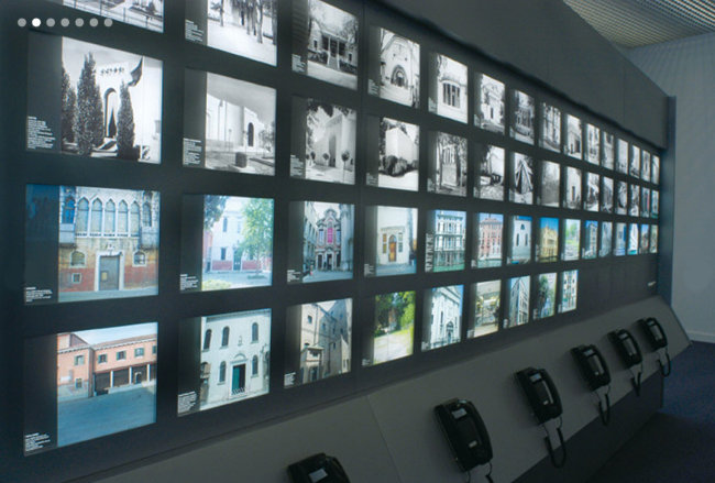
Augé obliquely discusses Antoni Muntadas' installation in the Spanish Pavilion at the 2005 Venice Biennale. I say obliquely because there is very little physical description of the artwork: I had to find that elsewhere. According to Michèle C. Cone in The Brooklyn Rail:

...Muntadas showed details of his research on the history of the pavilions in the Giardini, the lovely grounds of the Biennale. His intention was to make perceptible the fact that the “Giardini” in 2005 looked quite different from what they had looked like earlier, especially during the era of Mussolini when, for example, the Italian pavilion was reconstructed to suit the Duce’s taste, and then rebuilt again after World War II. Much had been lost in translation since the first Venice Biennale, much had been added, but it took a Spaniard to unveil the less than transparent history of an Italian landmark. The project was named On Translation: I Giardini. [4]

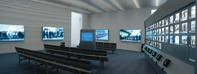
Art historian Reesa Greenberg gives more descriptive detail: "On one side of an angled freestanding wall, he arranged same-size archival and current photographs of the façades of the pavilions in rows, similar in structure and glow to arrangements of images of real-estate properties for sale or hotels for rent. Viewers could learn more by picking up the attached phones." [5]

muntadas_giardini_crop650w

This grid of photos appears in a sort of airport waiting area, along with another series of photos of people standing in line to get into various cultural events. According to Greenberg, the room also had a kiosk with "rolling aphorisms and statistical facts taken from the world at large ... information about the number of tourists to Venice in the last year, the number of dead and wounded in a Buenos Aires nightclub, the number of hits a day on Google, the number of Colombian soldiers killed in an ambush, and so on." [6]

pavilion2_650w

Augé writes about all this [machine-translated from French]:

A place and an institution rooted in time: this could well be the definition of the Venice Biennale. However accurate it may be in a sense, this definition raises many difficulties, at least today. The institution celebrates contemporaneity, but it endures. The place celebrates the spirit of the present time, but it consecrates the frontiers of the past. From then on, the contradictions are revealed and made visible. It only takes a little (but this little is everything) to bring them to light: contradiction between a recurrent celebration and the claim to embody the avant-garde, contradiction between the very idea of avant-garde and the representation of an eternal present that dominates contemporary representations, contradiction between the traditional organization of the Biennale (national pavilions, rivalries, competitions, prizes) and its ambition to express the state of artistic research in a globalized world, contradiction between the reference to Venice and the extra-territoriality of the Biennale...

Muntadas summarizes this set of questions by questioning not only the current status of Venice, but also that of the Biennale's setting, the Giardini, and that of the works presented there. The contradictions that jump out at us are no longer contradictions from the moment the artist... put[s] them into shape in order to question them. [T]he contradictions are always there... but change status by becoming the object of the artistic reflection.

We have to rely on Greenberg, Cone and others for descriptions of how historical photos of the Giardini "put into shape" the contradictions of the Biennale. Presumably the kiosk and telephones visible in the photos don't offer Cone's politically-tinged history of the Biennale grounds above. How are we supposed to know this? Augé writes:

[A]rtists have the difficult but essential task to signal to the public of the consumers, of which they are also a part, that they are, as artists, external to the system of production / consumption... This signal, to be perceptible, can only be the product of a ruse. If the classic putting at distance is impossible today [because art-making is part of a commodity system --tm], it is nevertheless possible to put the accent on the [inconsistencies] and tensions of a system which sacralizes the present and the image. By attacking the heart of the system in this way, we translate its spirit. Because it is less a question of attacking, here, than of "translating", as Muntadas says. The art does not aim primarily to subvert, but to show. It is up to the society or the public authorities to question, if the fact of showing takes in their eyes a subversive character. But to succeed in seeing, in order to show, it is necessary to find angles of view, to experiment, to displace the admitted limits, to shift the observation in time and space.

Ultimately, it seems, viewers have to puzzle it all out -- why does this pavilion look like an airport? what is the content of these photos? why are they placed here? -- and make their own connections. Augé implies the artist must "show" rather than tell.  We don't know how many Biennale viewers came to the same conclusions about the work as Augé, Greenberg, and Cone in their essays. Probably very few? At best we can say the ingredients for a shift in perception about the Biennale and its own agendas and contradictions are here.

NOTES

1. Dan Graham, "Legacies of Critical Practice in the 1980s," Discussions in Contemporary Culture, Hal Foster, ed., Dia Art Foundation, 1987.

2. Marc Augé, L'art du décalage, Multitudes, vol. 25, no 2, 2006, p. 139-147.

3. https://leparergon.org/index.php?title=Tom_Moody (French) https://www.tommoody.us/archives/2021/06/08/le-parergon-tom-moody-bio/ (English)

4. Michèle C. Cone, Antoni Muntadas and Translation, The Brooklyn Rail, Nov. 2014

5. Reesa Greenberg, The Currency of Time: Muntadas and I Giardini, Ciel Variable, Fall 2007

6. Id.
 

retro computer art and the aesthetic of the shift: 1. Dan Graham

A previous post discussed the use of recently outmoded technology to critique technology.
This post and the next delve more into theories that might support such a practice.

In thinking about "contradictions in the computer aesthetic" back in the 2000s, I wasn't aware of Marc Augé's writing [1] (cited by Pierre-Luc Verville in his essay on my artwork). I came to Augé's idea of the "aesthetic of the shift" (more about that in a later post) by way of artist Dan Graham, whose essay in a Dia Foundation symposium, "Legacies of Critical Practice in the 1980s," made a strong impression:

I believe now that the task of the artist is in part to resuscitate the just-past -- that period in time made amnesiac by commodity culture -- and to apply it as an "anti-aphrodisiac" (Walter Benjamin's phrase). The Rolling Stones song "Yesterday's Papers" -- "Who wants yesterday's papers? Who wants yesterday's girl? No one in the world" -- makes this anti-aphrodisiac aspect of the just-past clear. [2]

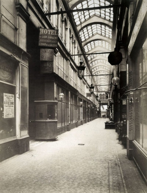
Like Augé, Graham wasn't talking about computers per se. He gave two examples. One was Walter Benjamin's Paris Arcades research. The arcades were glass-covered walkways that turned city streets into indoor shopping malls.

arcades-500w

These were an early-1800s idea of modernity that were mostly torn down in a later-1800s renovation of Paris by Baron Haussman.

haussmann_paris

Some arcades still lingered, jarring the traveler out of the dream of the "renovation" by exposing a substrate that was actually more modern.

About this, Dan Graham wrote:

According to Benjamin, "progress," the 19th-century scientific and ultimately capitalist myth, is expressed in commodities, fashion goods which "produce a sense of eternal newness." This makes progress a mythical goal, never to be reached, for there is always the new and it is always superseded by the next new. For Benjamin, then, progress is actually a state of stasis. And yet it is the very stasis that makes the recovery of the just-past potentially subversive.

Graham also mentions Gordon Matta-Clark, [3] who famously chainsawed out sections of buildings to expose their inner structures. Often this revealed a tree-ring-like history of the building's renovations, including design assumptions of earlier eras. Once again, the presence of this older, perhaps better-constructed, world jars us out of the eternal now of our modern cities.

matta-clark650w

The Arcades Project is a bit of a critical tabula rasa. Benjamin never finished the work so people project meaning into it. It has led to at least one awful-looking New York exhibit. Graham doesn't explain well how the arcades of the past critique the present (in the absence of a focused artwork). He mentions dreams, as if dreaming of the Arcades would jolt anyone out of the static continuum of present-day Paris. Graham's evocation of Matta-Clark better buttresses his argument: here at least is a physical thing an artist did to force recognition. In the next post, we'll discuss Marc Augé, who articulates "the aesthetic of the shift" bringing the past into the present, with reference to a contemporary artwork, Antoni Muntadas' pavilion in the 2005 Venice Biennale.

NOTES

1. Marc Augé, L'art du décalage, Multitudes, vol. 25, no 2, 2006, p. 139-147.

2. Dan Graham, "Legacies of Critical Practice in the 1980s," Discussions in Contemporary Culture, Hal Foster, ed., Dia Art Foundation, 1987

3. Frances Richard, Spacism: Gordon Matta-Clark and the Politics of Shared Space Places Journal, March 2019

annoying autobiographical post (3) - "retro" computer art

When I started making drawings on an office computer with Microsoft Paintbrush (mid '90s), and music on a Mac SE with Music Works software (late '80s), they weren't retro. My hope at that time was to demystify "computer art" by using everyday programs that people might have come into contact with. The key word wasn't outmoded, it was "simple." I was dismayed by the bad programmer art I was seeing, which was starting to appear in museums. I thought the best way for a fine art trained artist to use a PC was in the most straightforward, transparent way. For example, to make a hand painted portrait that was clearly done with a paint program and no accompanying narrative about the means of production. This turned out to be harder than I thought -- viewers assume anything made on a PC uses algorithms or software "cheats." Hand skill is effectively overwhelmed by the medium.

By the mid-2000s, I was stubbornly clinging to MSPaint and 8-Bit music as they became retro styles. In 2004 I began experimenting with animated GIFs, applying some of the pixelly MS Paint ideas I had been working with. At that time GIFs were definitely retro and seen as a '90s, dot com era phenomenon. I thought about Richard Phillips' use of dated fashion photography to make large scale oil paintings and remembered this 1987 quote from Dan Graham:

According to [Walter] Benjamin, "progress," the 19th-century scientific and ultimately capitalist myth, is expressed in commodities, fashion goods which "produce a sense of eternal newness." This makes progress a mythical goal, never to be reached, for there is always the new and it is always superseded by the next new. For Benjamin, then, progress is actually a state of stasis. And yet it is the very stasis that makes the recovery of the just-past potentially subversive.

I believe now that the task of the artist is in part to resuscitate the just-past -- that period in time made amnesiac by commodity culture -- and to apply it as an "anti-aphrodisiac" (Benjamin's phrase). The Rolling Stones song "Yesterday's Papers" -- "Who wants yesterday's papers? Who wants yesterday's girl? No one in the world" -- makes this anti-aphrodisiac aspect of the just-past clear. [1]

I never articulated my "program" the way artist and musician Pierre-Luc Verville does below but I think he gives a compelling reason for all those MS Paint drawings and animated GIFs:

What is contradictory in the computer aesthetic is between what we expect from computer tools and what they do. Moody exploits this paradox by turning the fundamental elements of the perceptual system of computer environments into expressive elements that refer directly to the history of art. By exaggerating what the computer may or may not be expected to produce aesthetically, Moody reveals a world whose conditions of aesthetic possibility are constantly being transformed by the machine.

The appropriation of obsolete devices is thus the occasion for a critique of the obsolescence of the various aesthetic stages of the computer, for a re-reading of the horizon of expectation which frames the experience of it. [2]

Just as the "simple" had been used to critique the overly complex, the "old" can be used to critique the seamless world of the so-called 4th Industrial Revolution: the interconnected virtual reality of smartphones and platforms -- the latest incarnation of Benjamin's stasis of eternal newness. A pixelated sphere was the best a drawing program could do in 1984. What limitations (or assumptions) might a super-duper slick iPad be putting on something made right now? I also appreciate Verville's implication that art history can be used as a gauge or measuring device. Unlike my attempts at portraiture, everyone can see that the pattern of concentric circles (Kenneth Noland target) is made up of pixels in my OptiDisc gif. What similar soon-to-be-dated constituent part might the seductive iPhone be hiding? In future posts, I'll be comparing my theorist of choice, Dan Graham, with Verville's, Marc Augé, on the topic of past-as-critique. (They are saying very similar things.)

pause_prelude_optidisc

Tom Moody, OptiDisc, projection of animated GIF file, "PAUSE (Prelude)" exhibit, Haus der Kunst, Munich, Germany, 2018

NOTES

1. Dan Graham, "Legacies of Critical Practice in the 1980s," Discussions in Contemporary Culture, Hal Foster, ed., Dia Art Foundation, 1987

2. https://leparergon.org/index.php?title=Tom_Moody (French) https://www.tommoody.us/archives/2021/06/08/le-parergon-tom-moody-bio/ (English)

Le Parergon: Tom Moody bio

Thanks to artist and musician Pierre-Luc Verville for including me as a topic on his website Le Parergon. The writing is in French; below is a machine-translated version. I added the hyperlinks for additional background.

Tom Moody

Tom Moody is an American musician, visual artist, and art critic. His work is characterized by the détournement [diversion, hijacking] of digital means of expression in order to subvert or sublimate their contradictions.

Biography

...Moody studied literature and art in Charlottesville [VA] and then in Washington, D.C., before moving to New York City...

Course of work

Banality and technical obsolescence are two important leitmotifs in Moody's work. Both embracing the limitations of the tools he uses and developing his art within the corporate world he infiltrates, he creates a body of work that can be said to explore the aesthetic and social ramifications of postmodern computing. His music explores the sonic aesthetics of the computer retroactively, as well as the aesthetic peculiarities of telecommunications and computer technologies and the social fantasies attached to them (Generic PC, 2017; Hypercylinder, 2019). In the visual arts, he is interested in optical effects, the dialectic between economy of means and maximalist aesthetics, and the changes brought about by new techniques in pictorial production (Kevin, Les, Steve, Kerry, oil on canvas, 1979-80; Advil Box, 1994, acrylic on promotional display box).

An aesthetic of the shift

From a technical point of view, Moody's art exploits the extreme limits, even paradoxes, of digital forms of expression. The audiovisual and minimal computer environment of the late 1990s (Microsoft Paintbrush and Paint, Windows 95 and 98, Sound Blaster, etc.) is reused by the artist in a way that subverts the corporate logic of the computer.

What is contradictory in the computer aesthetic is between what we expect from computer tools and what they do. Moody exploits this paradox by turning the fundamental elements of the perceptual system of computer environments into expressive elements that refer directly to the history of art. By exaggerating what the computer may or may not be expected to produce aesthetically, Moody reveals a world whose conditions of aesthetic possibility are constantly being transformed by the machine.

The appropriation of obsolete devices is thus the occasion for a critique of the obsolescence of the various aesthetic stages of the computer, for a re-reading of the horizon of expectation which frames the experience of it. In other words, his appropriation of computing is an art of the shift, which consists in shaping the contradictions of the aesthetic language of the cybersphere in order to question them [1].

References

1. Marc Augé, L'art du décalage, Multitudes, vol. 25, no 2, 2006, p. 139-147.

thoughts on Grant Wood

Grant-Wood-March-MFAH-600x446

Grant Wood, March, 1940, charcoal on wove paper

In the Texas visual arts magazine Glasstire, former publisher Rainey Knudson considers the above drawing, owned by the Museum of Fine Arts, Houston. Her essay, "Do Art Critics Need to Know How Sausage Is Made?" has two parts. In the first, she describes her experience of going back to school, after many years as a professional art writer. She tells us what she learned in a college-level drawing course, and how it changed her perceptions about artworks. (1) In the second part she critiques the Wood drawing, as a kind of test of these perceptions. Employing a series of close-up photos, she discusses the artist's techniques (crosshatching, erasure, etc.) and how they give interest to the work.

She doesn't really cover the content of the drawing, however. She says a "picture of a country road disappearing into a landscape" could be "sappy" if not for the "energy and movement" of certain marks, and the artist's intuitive handling of texture, but that's about it.

I haven't seen this drawing in person so this is a "jpeg review," take it for what it's worth.

Grant Wood is known for his stiff, iconic portraits of rural Midwestern subjects, American Gothic being the most famous. Perceived as a slightly bohemian "character" in his native Cedar Rapids, Iowa, he was nonetheless a staunch regionalist, and famously wore farmer's overalls to make the point. He had taken several trips to Europe in the 1910s and 1920s but remained mostly unaffected by Modernist art movements in his early career. He had absorbed some of the "arts and crafts" thinking of fin de siècle Romantics but resisted the more extreme lessons of Cubism, Surrealism, and pure abstraction. (2)

In the populist 1930s his regionalist vision was celebrated but near the end of his life, when this drawing was done (he died two years later), a backlash against his type of art was in full swing. He fought bitterly with members of his own university art department, who saw him as a self-promoting hack and has-been. After several years of glowing press, his reputation was starting to slip. Publicly he continued to fight for the regionalist vision, but privately he was vexed by the criticism, and strove to make his last works more abstract and Modernistic, incorporating rhythmic patterns and geometric compositions. (3)

wood_march_litho650w

The lithograph version of March (above), belongs to these late semi-abstracts but is fairly calm and composed, at least from what I can see from a jpeg. Even as a digital reproduction, the drawing version that Knudson reviews (seen at the top of the post) feels more dynamic. A simple country road winding through bald hills becomes a jagged slash of movement. Strong gusts of wind blow from left to right while afternoon sunlight beams in the opposite direction. The crosshatched hills seem to throb and undulate. All this movement is even clearer in the detail posted by Knudson:


Grant-Wood-March-MFAH-detail-2-600x404

Grant Wood, March, 1940, charcoal on wove paper (detail)


There's a well-known tendency for artists to tighten up when making formal "permanent" statements such as paintings but to be carefree and honest when drawing. Perhaps that's what happened here. Pure speculation, but this may be more of a reflection of Wood's emotional state at the time than the more polished, lithographic version of the same image. ("They say I'm not modern -- slash slash with the eraser -- I'll show them!" might be his thought balloon as he worked on this.)

Wood's angular hatching and patterning recalls Cubism's folds and involutions, or some crazy Futurist cityscape. Yet instead of explosive urban traffic there is only a lone horse pulling a carriage. It's as if Wood wanted to depict a calm America, a place of rural, nostalgic refuge, while at the same time channeling The Vortex. His slightly superhuman, illustrator-confident hand facility perfectly balances aggression and control, giving us not so much a drawing as a map of unresolved doctrinal tensions.

Despite the patriotism of World War II era, American culture was changing around this time. Fleeing the war, European artists moved here and brought international art attitudes with them. (4) New York became a world art capital, cosmopolitanism became the norm, and "regions" became objects of anthropological study rather than sources of inspiration. Wood's small town conservatism, already beginning to be an issue in the 1940s, would certainly kill his chances of acceptance today in the world of museum installations and international art fairs. Were he making this work now he would be doomed to remain cordoned off in the "other art world" of people who collect Remingtons.

Even though drawing is perceived as more ephemeral than painting (still) among curators and collectors, it's nevertheless an act of freezing time and fixing history, in comparison to digital art products, which can be manipulated in endless ways. The idea of creating a timeless, stand-alone artifact seems quaint now but in Wood's time what went down on the paper had to count -- that's what art was. This may explain the level of verve and commitment that can still be perceived even in a series of jpeg details, long after battles over "regionalism" have dwindled down to nothing.

1. In the comments to the Glasstire essay, an artist complains that Knudson's years of pre-art class criticism were "like expecting someone who has never even held a screw driver to be able to tell me how to fix my car." Like Marshall McLuhan coming out from behind the theatre sign in Annie Hall, ex-Newsweek critic Peter Plagens suddenly appears in the thread and responds: "Old saying: You don’t have to be a chicken to know a rotten egg... Art writers and curators aren’t trying to tell you how to fix your car (metaphorically, how to make art). They’re judging your art -- something that viewers do, in writing or not, all the time... Betcha when the judgment is along the lines of, 'Hey, that’s a great piece of art you made!' you don’t complain about being judged."

2. Wanda M. Corn, Grant Wood: The Regionalist Vision, Yale University Press, 1983

3. Id.

4. Id.