Chelsea Snapshots

Going up across from Gagosian--"sixteen limited-edition riverfront homes with en-suite sky garages." Every New Yorker's fantasy is to have their car on the same floor as their apartment. "Limited edition"--genius marketing in an art district. (Email from MA: "I take it this means that each 'home' has an elevator into which the home-owner drives his car? And the elevator then carries said car and owner to their home with 'en-suite garage'? Or do they just lift the car up with a crane, stick it into the garage, and then wall the hole over so the owner can come and admire his or her car when he or she feels like it without any thought for driving it anywhere? In either case, this strikes me as being one of the most extreme examples of conspicuous consumption in my experience.")

sky garages

Below, a nice piece by Pier Paolo Calzolari, from 1971, at Luhring Augustine, in a museum quality group show of Italian conceptual/povera art from the '60s through the '80s: Pistoletto, Merz, Boetti, etc. This sculpture has a refrigeration unit keeping half the piece frozen (with no dripping)--I like the way the metal supporting the neon words droops on the right like limp fabric.

Update: The blog VVork presents recycled versions of work that looks like this. A VVork artist, though, would have the neon "art adjectives" spell out some world-saving political message, or wouldn't have the subtle touch of the limp metal, which serves no purpose with regard to saving the world through art. Almost always the work of this nature from 30-40 years ago is better, tougher, and stranger than the nth completely unconscious iteration of it.

calzolari

Two sides of the street: past future, future past

One side of the street (Newark Ave, Jersey City, NJ). The Sleep Cheap store has a "googie" facade, a future-looking architecture style of the 5os and 60s. The Valu-Plus logo is a study in minimalism, balloony serif font notwithstanding.

sleep cheap

valu-plus

On the other side of the street, stores are being converted to the Main Street America look as part of a civic makeover. In the future the googie will be gone and the whole block will look like the past. The only thing "tech" about these signs is Nail Tek.

main street 1

main street 2

Update, March 2011: The blue tile on the sleepcheap facade was removed not long after this post. The metallic swimming pool outline is still there, surrounded by a vague yellowish sandstone texture. Some of the above photos were being hotlinked as some kind of stock photography so I changed the filenames.

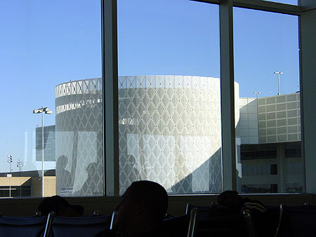
bored at the airport photos

Thanks to American Airlines I was 3 hours late getting home to NY, despite the perfection of the weather in Houston, where I sat on the ground for two hours, waiting to travel to Dallas for my connecting flight to La Guardia. The weather was also perfect in Dallas. Why the delay? We don't know--something to do with "maintenance." These are photos from Houston Intercontinental, which we should all be uncomfortable calling by the name of the President's dad. The top image is a puffy, lenticular poster; when you move your head from side to side, the lynx's head bobs up and down.

bored at the airport 1

bored at the airport 2

bored at the airport 3

bored at the airport 6

bored at the airport 4

bored at the airport 5