The Good


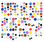
Michael Manning's work at the NADA art fair this year (reproductions cribbed from various online documentation). Note that the color doesn't have to "go" with the texture. Smart! These are handsome objects that don't take themselves too seriously, as with Manning's phone and tablet paintings that raised the ire of Art F City commenters because of their lethargic finger wiggling. Real men use their muscles!
The Bad


The Hole gallery shows this artist, Matthew Stone. Haven't seen these in person but the concept doesn't appeal. Evidently they are based on photos of "phat" brushstrokes (as in, self-consciously flamboyantly lovely) that are then transposed into impossible environments where they cast fake shadows on pointless geometric objects. We've been here, in the '70s, with abstract illusionism, and it didn't go well.
The Ugly

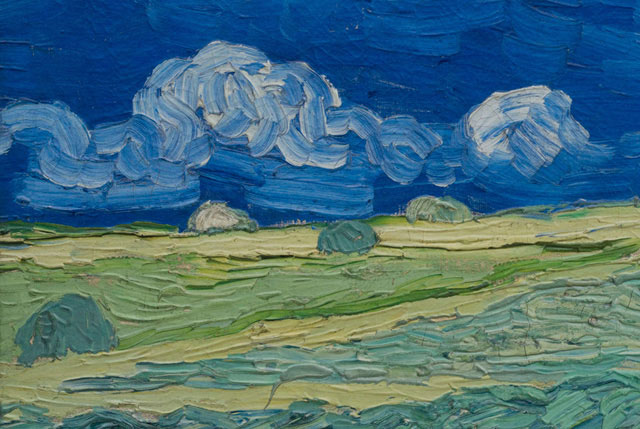
Yes, that would have to be Van Gogh reproductions sold by his namesake museum. All this ingenious algorithmic mimickry of color and texture in the service of Puff-Paint™-like kitsch. Maybe they are amazing in person but again, it's the concept that's revolting. Is our understanding of Van Gogh's work enhanced by running it through the Star Trek replicator?


