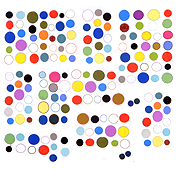
hat tips noisia (who made the web app) and D_MAGIK
also, Santiago Calatrava, whose sucky ornamental winged thing will soon be gracing the revamped World Trade Center's "transit hub."
It looks kind of like the design above but with "wings" that are awkwardly asymmetrical and jammed too close to an adjacent building.
architecture
Weird Stretched Zombie, 2014, clip of found video
Video clip [9.3 MB .mp4]
Screenshot of video frame (detail):
Jules asked, "is this your net art?" Yeah, man, this is postNastyNets art where we condescend to an innocent YouTube uploader sharing a cool glitched zombie from a shooter game. But seriously, the zombie that somehow became surrealistically mingled with a communications tower, so that it stretched far up into the sky, appears strange and beautiful in an environment of tawdry, unrelenting commercial bleakness. As the program notes for this net art explain, "The shooter's POV ascends briefly to determine if this is enemy or architecture."
In the screenshot above, the zombie is visible in the upper left of the frame. In the clip, the "camera" swings around and studies the zombie sculpture from a moving, ground-based position. Very quickly, lest the other zombies catch up and eat the viewer. Then, once around the industrial wasteland, and back for a second view. On the second pass, a bizarre bird-thing can be seen hanging frozen in air next to the sculpture.
Real Native Plants Imported from Asia
Before the High Line became a tourist destination it was a classic post-industrial decay scenario: an elevated botanical garden of weeds and wild grasses that you could only view from the upper floors of certain West Side buildings. (Above is one of the last of such glimpses, from two years ago.) It had charm as a bit of random, windblown nature existing in the city and when it came time for it to be yuppified as a city park, the architects and promoters made a big to-do about using only "native plants and grasses" to landscape after they tore out all the random stuff.*
Now, maybe not so much. Buried in a recent Salon scare story about supposed cold-resistant cockroaches invading New York (always, something is invading) lies the nugget boldfaced below:
New York’s High Line, an abandoned elevated railway transformed into the city’s hottest new park, is responsible for attracting swarms of tourists to Manhattan’s West Side, revitalizing/gentrifying the area and, according to researchers at Rutgers University, introducing a new species of cockroach never before seen in the U.S.
Periplaneta japonica, common in Asia, was first spotted by an exterminator in 2012. The researchers believe it arrived as a stowaway in one of the imported plants adorning the park.
Only in America, as we used to say: Real Native Plants Imported from Asia. Also, free (one dollar surcharge may apply in some states).
*The High Line is still pushing the locavore angle but includes the fudge words "focuses" and "most" in these claims:
The High Line's unique landscape was created in partnership with Netherlands-based planting designer Piet Oudolf. For inspiration, Oudolf looked to the existing landscape that grew on the High Line after the trains stopped running. The plant selection focuses on native, drought-tolerant, and low-maintenance species, cutting down on the resources that go into the landscape.
and
Local Sourcing: Most of the High Line’s plants are native species, and many were produced by local growers. Locally-grown plants are better adapted to grow successfully in our climate, reducing the amount of plant failure and replacement costs.
Except when the occasional import from halfway around the globe introduces invasive insect species.
atlantic city visit - some notes
Earlier this month I took advantage of a special rate and stayed at the Revel (rhymes with "bevel") taxpayer-supported hotel and casino complex in Atlantic City, NJ. (Hat tip to family member who was the perfect sardonic traveling companion.)
My first time in that city. What a mess.
It's easy to see why Atlantic City has so many problems, when you go there. It's truly remote from anywhere, cut off from the rest of the state by the Pine Barrens and miles of swampland. No major highway or north-south train line goes through. The town was rotting as a resort destination so the revitalization effort has been pegged to these enormous slick gambling complexes. Sealed enclaves that are meant to be worlds unto themselves, where you eat, swim, see shows, get massages, and of course gamble, without ever leaving the building until you are bled dry of funds and kicked out on the street to join Romney's 47%.
The Revel squats like the Death Star on a section of artificial beach (still under construction), cutting off the nearby houses and streets from easy access to the water and Boardwalk.
The city blocks "behind" it (invisible to hotel windows aligned for maximum waterfront views) are bleak neighborhoods of vacant lots, boarded up prairie gothic houses, and probably some of the cheapest-to-rent multiplex apartment units in America (due to ultimate impoverished scariness). Beautiful in a J.G. Ballard, what-has-become-of-our-cities way.
The Revel suites are luxurious, if sterile, and the view of the ocean from 17 stories up, looking out through heavy glass, is like being in a Michael Mann movie set on the planet Solaris.
Near the elevators I was amused to see framed artwork by James Nares and my former teacher, the post-Minimalist artist Robert Stackhouse.
A printed "amenities" menu in the hotel room advises you that if you want to take the Android tablet on the bedside phone, it can be had for $800.
Sarah Oppenheimer
Opening tonight at P·P·O·W Gallery in Chelsea.
Saw this work earlier today - hard to decipher from the photo but Oppenheimer cuts into the physical walls of the gallery to create these portals of glass and aluminum. One of them you can walk through and one is sealed by angular glass panes seated in deftly mitred trim. These relatively slight Matta-Clarke-esque interventions create funhouse spaces that are austere and elegant -- three-dimensional abstract compositions of available light, depending on where you're standing.
One also thinks of Dan Graham's rooms where you view other people viewing from behind transparent barricades. Yet design-wise the closest comparison I can think of is Australian artist Stephen Bram's gallery revamps, which I saw in Munich years ago. He is much more aggressive about building out additional walls to create his angled spaces. Oppenheimer only makes you think she is doing that much labor-intensive work. Her labor is thinking and observation to find the slightest pressure points in existing architecture to turn rooms inside out.