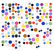
Eric Shaw writes about painter John Pomara in Glasstire, the Texas online art magazine. An excerpt from his essay:
The artist had a revelatory moment in 2011 when he discovered a website spazzing out, creating picture mash-ups that captured his imagination. He screen-saved like mad for two days before the resident web-master stuck a savvy thumb in the download dike.
That spurred Pomara to learn just enough coding to frack his own on-screen picture streams. He now captures these pastiche beasts, and reconfigures them still more by layering and, occasionally — for the love of white — by pouring on bleach. This wipes out structured sections of his fragmented pictures, reclaiming drip-technique appearances we naturally attribute to Neo Ex and Ab Ex exemplaries.
Ever since Lascaux, artists have exploited the misshapen aspects of undersurfaces to inspire figure, line, and shape. Pomara couldn’t be looking at anything less dense than a cave wall, but his strategy’s the same: use the rich diaspora of Lady Chance to guide one’s hand. Make nice with your “mistakes.” Give the glitch a brush and make it paint a wall.
He still roves the rabid lands we see on laptops for found objects — instances of mistaken juxtaposition, errant cropping, or bad coding. His reports on encountering this stuff is uncanny. I’ve never seen it. (Have you?) Pomara sees it all the time. The fates are going to bat for this man it seems.
As Rauschenberg adopted a scavenger’s aesthetic in the ‘50s, utilizing the detritus of city streets and pop culture to create rummage-strewn compositions, Pomara is a Rauschenberg of electron viewscapes. He builds an aesthetic from that world’s flotsam and puts it in canvases and prints — ones that are made through mechanical processes themselves.
I responded with a comment:
Thanks for this in-depth look at Pomara’s work; in all the extensive writing that’s been done on him in the past (catalog essays, newspaper articles, online journalism), his “glitch” processes and the reasons behind them are rarely if ever explained with such detail or passion.
One comment of the author’s surprised me -- that he hadn’t himself seen “instances of mistaken juxtaposition, errant cropping, or bad coding” while surfing the web.
The sellers of smartphones and social media interfaces certainly aim for a “seamless” experience and anyone who actually has one is to be congratulated. My own experience of the web, on a range of devices, with even the fastest connections, is one of half-rendered pages, mistakenly sized fonts, and blinking dropdown menus. There are actually websites and entire communities devoted to the unseamless experience in all its humor and horror. “Annoying.technology,” “The Website Obesity Crisis,” “The Triumphant Rise of the Shitpic” and “In Defense of the Poor Image” are just a few examples.
I took the photos in this post in the gallery, while the show was up. It's hard to get across the physical presence of the work. Below is a detail (unfortunately grainy) showing the honeycomb aluminum panel and some of the glitch patterning converted from internet to paint.


