addendum to sara ludy post

Have been massaging this paragraph on the non-romantic new romantic Sara Ludy -- it's a bit clearer now:

Ludy describes Pan GIFs as "a series of animated gifs displayed as tiled backgrounds. Each gif is composed of two photographs that alternate with a linear transition, creating a repetition which both embraces and attempts to break the mundanity of everyday landscapes and architectures." By means of a simple, sweeping left-to-right pan one photo gradually eclipses a second, different-angle view of the same subject (a forest, a wall with cast shadow, a plant in a planter). While the scan is occurring a clear reading of both images breaks down. Because the GIF is "tiled" the scanning movement repeats across the entire screen, providing a view rather like an insect's compound eye. This causes a single predominant color or texture momentarily to colonize the screen. The lurch into a de-familiarizing zone of pure form is a classical technique, even though the underlying images may be romantic ones of gardens and hillsides. But even the disrupted tropes aren't that romantic: they seem to have been chosen for a vibe of sterile alienation.
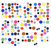
from brand-brand to art-brand (more on michael manning)

Thanks to Michael Manning for the shout and Lindsay Howard for noting my (doomed) attempt to give context to his paintings -- the occasion is this Rhizome interview of the former by the latter, published yesterday.

In January last year I wrote this about Manning:

[His] recent images consist of touchscreen paintings with menu-selected brushes, textures and hues; am guessing these are "augmented finger paintings" and not done with a stylus. He has made them on the iPad as well as with Windows 8 demo screens inside the Microsoft Store [alien country for the Apple-brainwashed creative elite -- obligatory dig --ed.]. The buildup of color, washes, and calligraphic line in digital gesture painting can be seductive but let's remember the original AbEx artists also employed cinematic scale, gloppy physical media, and the athleticism of pushing the glop around with long-handled brushes. They would have laughed to see people making micro-movements on a TV screen and then saving them as jpegs and PNGs. The "action painting" model has been pretty thoroughly discredited but those are the reasons it's in museums, at any rate. Am possibly more interested in Manning's steady output of tiny de Kooningesque and Twomblyesque color-spasms as performance-cum-notation having to do with "available technology" and the instant masterpieces "apps" promise to deliver than some electronic de-reification of the earnest Real of gestural abstraction, although both motivations might be present. Also they are pretty, and it's always good to annoy the Marxist art-as-hair-shirt crowd.

The next day Brian Droitcour covered the same work for Rhizome but couched it more in terms of brands and corporate colonization of the web. Essentially he said that Manning is post-brand in not restricting his work to a single "silo." Yet both of us mentioned the Microsoft Store -- Rhizome even ran a photo of a store exterior. That's a hook and refers to a brand even if it's an ironic joke. I ventured that the "Store" paintings were actually better than the iPad paintings and Droitcour accused me on twitter of loving Microsoft. Now Manning says we're both nitpicking because "I don't really care about brands or the branded part of any of it, I just look at them all like toys lol." (Then why did you call them... oh, never mind.) None of this matters in the slightest to the art dealers who are currently selling printed-out versions of the paintings -- all the collector wants to know is that it's being written about in the right venues. More power to Manning for leveraging the critical vacuum to his advantage, I guess. His own stated reasons for doing the paintings are perfectly valid.

frank zappa "weasels" trivia

weasels

weasels_sources

From a web page called eclectic obsessions:

Frank Zappa recruited artist Neon Park to create a subversive image based on
a cover story from the September 1956 issue of Man's Life, (a Men's adventure
magazine). After showing Neon a copy of the magazine, Zappa inquired, "This
is it. What can you do that's worse than this?" Neon's answer was to craft a
parody of an advertisement for Schick brand electric razor based on the
"Weasels Ripped My Flesh" theme. The record company released
the album despite its reservations about the album cover.

This is an iconic '60s/'70s LP cover, subversive because it gives a disgusting and disturbing spin to bland and hopeful Eisenhower-era advertising, and because one did not expect to witness self-mutilating "cutting" behavior while shopping the pop music bin. The genius of the image is taking an actual slogan and context from the "repressed" side of the '50s -- a homoerotic painting of a bare-chested man being attacked by wild animals -- weasels no less -- and grafting it onto a safe image of a man shaving with a newfangled device from America's flying car future. A double irony is that the weasels illustration was on the cover of the magazine (albeit back-of-the-rack) while the shaver is barely glanced at commercial fodder from the inside.

One might wonder about the fate of such an image today. In its day, it needed gatekeepers who felt uncomfortable about it but ultimately approved it, and it needed a distribution scheme, in particular, cardboard record sleeves shipped to stores across the country, including discount centers in small towns dependent on the "coasts" for culture. It needed an authoritarian structure to push back against, and it needed to be able to "slip through the gates." Now it might garner a few hundred tumblr notes, depending on who was releasing it, and it might help improve an LP's click-through or download visibility, but without a hot button topic such as racism or sexism it has nothing to rebel against. It's merely disgusting and disturbing (and well-painted).