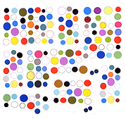
This Anthony Antonellis GIF was Art F City's "GIF of the Day," but why? It's kind of the standard blitzkrieg of data: approximately 50 GIFs, represented by only a few frames each, that move in space as well as time. But the spatial movement isn't particularly noteworthy -- it goes diagonally down, straight up, diagonally down, and straight up. An uninspiring zigzag gesture, filling up space as it goes. The frames go too fast for the mind to absorb, even on repeat viewings, but we see some obvious net-ish signifiers: Britney, QR code, alien head, a Francoise Gamma (?) gif. What are we left with? More noise, more useless information, dazzling but ultimately joyless.
Some have declared GIFs "over" and yet, this trend never got much of an intelligent airing. There were a few essays, and the show Art F City did where some yelling occurred after one of its premises was churlishly questioned by a participating artist. The point was to have some critical traction for these slippery modern ephemera. Not sure if "GIF of the Day" or ladder competitions do that.
