GIF Rescue - Anna Thompson

anna-thompson

Another undeserving also-ran in an ill-considered GIF-off competition.
In his book Untwisting the Serpent, critic Daniel Albright wrote at length on a theory of "gestus," particularly in reference to Brecht/Weill musicals: "A gestus... might be defined as an entity intermediate between a gesture and a narrative; a sort of schematic of a human figure that defines or epitomizes a whole discursive context in which such a contortion might come into play," he ventured.
If we had a theory of GIFs (and we barely do) that would be an important aspect of them to consider: the extent to which they are suited to iconic moments symbolizing a larger story. In the case of Anna Thompson's GIF above, of the three-frame cinema variety, one might well ask what the larger story is. A tale of Brooklyn hipster failed romance set against a background of gentrification. The man is a primal spirit, beating out a tattoo on building sides wherever he goes, but such an airhead. The woman is smarter than that and waves him off, but somehow keeps his nervous energy bottled in a magical hand movement that she can take wherever she goes.
Or whatever. One noteworthy point about this GIF is that while it mimics the pompous style of a cinemagraph, the whole thing is in jerky, spastic motion, adding to the comedy of the arrested romantic development.
GIF Rescue - Tony Luciana

tony-luciana

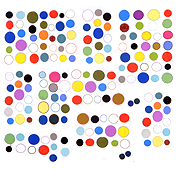
You have to admire an artist who goes into arena full of noisy chest-thumpers and does something quietly stupid. Possibly Luciana didn't think this thimble-sized animated Mondrian with an illegible signature in the corner was dumb and that's just a critic projecting an ironic view. On its merits, even given that Mondrian parodies are an entry-level fine art joke, there is appeal to watching this one draw itself. Where will this line go? How many more lines? Which squares will be filled in with color? Will balance be preserved? Surely Piet himself, sitting in his studio of austere rigor, asked much the same questions as he was working.

Saved from competitive environment by GIF Rescue Service.

unexamined GIF of the day

This Anthony Antonellis GIF was Art F City's "GIF of the Day," but why? It's kind of the standard blitzkrieg of data: approximately 50 GIFs, represented by only a few frames each, that move in space as well as time. But the spatial movement isn't particularly noteworthy -- it goes diagonally down, straight up, diagonally down, and straight up. An uninspiring zigzag gesture, filling up space as it goes. The frames go too fast for the mind to absorb, even on repeat viewings, but we see some obvious net-ish signifiers: Britney, QR code, alien head, a Francoise Gamma (?) gif. What are we left with? More noise, more useless information, dazzling but ultimately joyless.

Some have declared GIFs "over" and yet, this trend never got much of an intelligent airing. There were a few essays, and the show Art F City did where some yelling occurred after one of its premises was churlishly questioned by a participating artist. The point was to have some critical traction for these slippery modern ephemera. Not sure if "GIF of the Day" or ladder competitions do that.