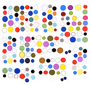
"The Wrong - New Digital Art Biennale" has already vanished into the aether with this page promising "we'll be back in two years."
But, but, we thought the Internet was forever.
Fortunately Joel Cook made this clear and comprehensible user interface for the various pavilions, for those of us who had planned to spend two years perusing all the art data in that bursting-at-the-seams event. (Up to now I'd barely covered my own pavilion-mates).
In 2015, The Wrong should hire Cook to make their front page -- the one they had was kind of a mess.
In fact, many of the pavilions could have shed their high concept landing pages, which recalled the Flash intros of the early 2000s, and not in a good way.
In art as in life, people just want to get where they're going, not to be entertained en-route.
