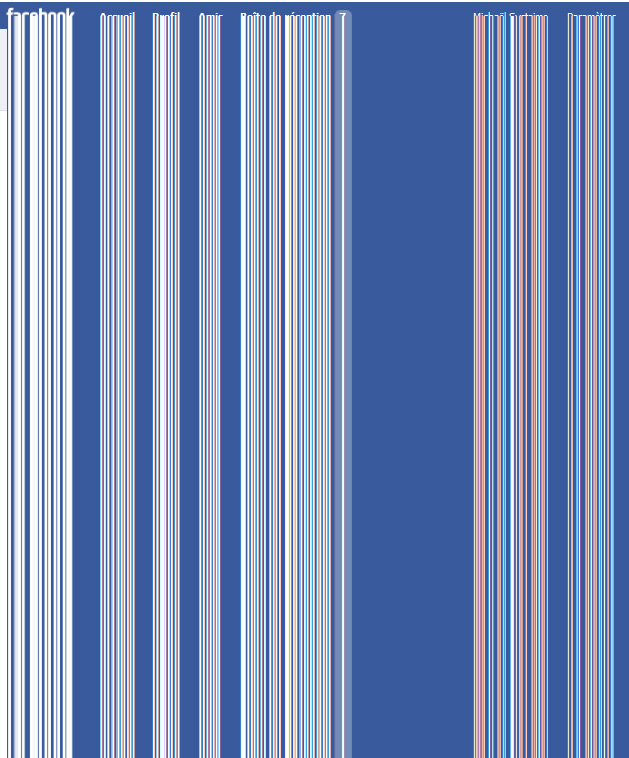
detail from facebook remixes, by SYSTAIME
indirect hat tip to Nullsleep
Felt like torturing myself so have been surfing around some Facebook blogs as a non-logged-in individual. Many thanks to Nullsleep for sending links to glitch artists who fill up their Facebooks with ASCII-style typographical noise--that seems like a compelling use of the "medium."
One thing you notice as someone who doesn't live there is how much more like MySpace it is, design-wise, than, say, some of the more minimal tumblr blogs. The Zuckeroids try to put so much on the page that it's busy and I would say junky looking. One feature that seems to have been adopted by Google+, unfortunately, is the constraint or miniaturization of people's content so all that other data can go on the page. Have chafed for years against a 580-650 pixel width limit and it would be hard to accept 400 or whatever theirs is.
Navigation also kind of sucks--when you go backwards in time in a "wall" (blog) and click on something and then something else, you have to keep going back to the first page of the "wall" to orient yourself--there are no monthly sidebar links as on the classic blog model. Am probably missing something but don't really care - it's not an inviting environment for someone who isn't partaking of all the friending and comment dramas.
OK, sorry for this unfrozen caveman report, am mostly just filling up space with typographic noise to separate the next and previous posts.