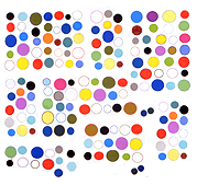
Speaking of the GIF zeitgeist: despite Google's supposed embrace of the file format designers love to hate, animated GIFs don't look so good on the company's new AOL/Facebook wannabe, Google+. The GIFs need more space around them and the avatars compete with them. Yet everything on the page seems miniaturized, to enforce a uniform layout.
On dump.fm, avatars are segregated into a chatroom "userlist"--that's better. A chat room isn't the same as a blog, but even on the dump "log" pages each post fills almost the entire width of the screen. Hats off again to Ryder, Scott, Tim and Stefan for "getting it" and offering an artistic (but not arty) alternative to the commercial blog-mills' graphic environments. Many of the derogatory statements made in AFC comments and elsewhere about MySpace as a GIF ghetto are basically also true of G+.
