

Day: October 8, 2011
ranting about ranting
The use of the word "rant" in the previous post raises a topic: the decline of the rant in the age of social media.
In the print zine era rants were prized and savored. People subscribed to and anxiously awaited their xeroxed, stapled magazines in which a lone angry person railed in an honest, uncensored way you never saw in the mainstream media.
Ranting is intelligent. Bill O'Reilly and Chris Matthews aren't ranters, they're shouters, completely approved by the system as a faux-outlet for mass frustration.
Ranting is stimulating. Andy Rooney isn't a ranter, he's a bore, with conventional opinions rooted in some imagined, non-existent past.
The early blogosphere was a place for zine-style ranting. The late Steve Gilliard and The Rude Pundit became stars without any assistance from a paid PR firm--just search engines.
Blog comments, however, require a different skill set than mere eloquent monologuizing (monology?). One must appear to be polite, and to take others' opinions into account. In the comment world if you are too blunt or honest you are marked as a troll.
In the corporate blog-mills that have arisen post-blogosphere (since 2007 or so) comments and interconnection are more important than the posts that initiate them. Bloggers write anticipating comments and how they will respond to them. A kind of TV-like happy talk becomes the norm. ("Super!" "Loved it!")
Stage Gloodle Page + final jobs rant

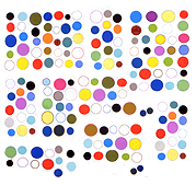
from a page of animations by Stage made with a vintage ('90s) program called Gloodle. (No relation to the lesser satan.)
Gloodle is Windows-only and 13 years old but the animations Stage is making aren't old art or Bill Gates art. The work is basically moving painting a la Oskar Fischinger, pared down into manageable loops for web consumption/distribution. There is an exotic or retro-tinged element to the work mainly because it strays from the defaults of Apple, the computer of choice for most visual artists. The Mac default is a smooth, anti-aliased look, because Mac's designers misunderstand Web graphics as a form of photography, or font design, where the idea is to eliminate jagged imperfections and allow the viewer to sink into an image like a warm bath. Stage's animations are about sharp edges and contrasts--more specifically the clash between the depth illusion that is the specialty of this program and the 2D, Mondrian flatness of the graphics.
In classic three dimensional rendering background objects are smoother than foreground, and painters had tricks for making receded items more "gauzy." Photo-based programs, unfortunately, make everything "Gaussy" by default, robbing artists of the ability to use extreme contrasts or contradictions (something artists are wont to do). Fortunately these exotic expressions from the Windows environment can be made into GIFs and any browser--even Safari--will read them.
Whoops, this turned into an apple rant--consider it my obit for the man whose greatest achievement was spreading the meme that Mac was "the computer for creatives." Once he had these people on board they helped him spread the word, so his mighty capitalist empire based on closed-source control of copyrighted material could grow and thrive.


