Umbrico in situ

umbrico

screenshot - detail of post on Vvork re: Penelope Umbrico

Captured on 1280 x 1024 screen (the last square aspect screen in existence).
The reason people want nice, regular corporate social media sites is so this kind of chaos won't happen.
The design team will resize your images for you and make sure they stay within layout boundaries

See previous post. The vastness of Umbrico's project (aggregations of photos on storefront windows) is conveyed on the internet by having a jpeg 2000 pixels wide that necessitates side to side scrolling and penetrates other content on the page.
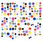
Compare and Contrast

this image on Vvork, attributed to Penelope Umbrico

with

this GIF by Kevin Bewersdorf, with a technical assist from Paul Slocum

The Umbrico jpeg says "large salon-style hanging of illegible photos that may or may not exist in real space." A sense of great density of visual information is conveyed without any associated meaning. In the Bewersdorf each component GIF is basically legible, despite this being a reduced GIF version of a high definition video that was shown in New York a couple of years ago. "Legible" in the sense that you can read off its individual parts--flame, fly, beating heart, eyeball, candy cane--as opposed to "blur, grey-green blur, slightly larger grey-green blur, etc."