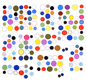
The "text altar" in the previous post was part of a series of text posts andrej did on dump.fm last July, a friendly/sarcastic critique of previously not-terribly-closely examined conventions that had developed on dump--in that particular case, the trope of placing objects side by side in symmetric configurations. As andrej noted in an email, "I think altars are sometimes a pretty lazy alternative to deeper aesthetic considerations--symmetry being a such a pretty and strong device." True, and some of the best altars acknowledge this by accentuating, exaggerating, or problematizing (academic word, sorry) their own symmetry. It should also be noted that "altars" or shrines are a folk-like adaptation or response to the dump software that were identified and called "altars" months (weeks? days?) after the fact. As designed by the dump founders, each "dump" is a horizontal line, like a line of chat text, that can accommodate "sentences" consisting of words, photos, webcam shots, glitter text, or gifs in any combination or size (up to 400 x 400 pixels per element). When a line reaches the right side of the browser frame it "wraps" to the next line. HTML is disabled so it is impossible to make grids such as this one, you have to work with the limitations of the line. One convention that developed early were concise symmetrical arrangements of elements that don't wrap. (They are a specialty for some dumpers such as jeanette, illalli, mirrrroring, and many others I ask not to be shot for not naming.)


