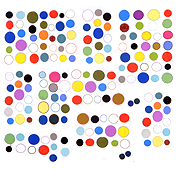

From a visual essay in the form of a massive logo dump (meant in a good way): "[IMG MGMT] Squiggles, Trees, Ribbons and Spirals: My Collection of Women’s Health, Beauty and Support Group Logos as the Stages of Life in Semi-Particular Order." The collection of over 200 logos from all over the internet offers a double indictment: of lazy, mediocre web design (the two above are kind of good/bad--most are bland pastel shapes done in Adobe Illustrator) as well the problem stated by commenter Chelsed:
i actually worked as a designer for a women’s org and struggled with this. there really isnt a “hip” way to portray women. the bathroom women icon is patronizing; these abstract squiggles and spirals appeal to an audience of women i havent yet encountered; so i just used the general woman symbol–but even then i feel like it’s TOO gender segregated. the problem is men dont HAVE a gender. men’s football is football. men’s soccer is soccer, etc etc– they dont need distinction. what is the symbol for women NOW?
The guest essayist/artist is Shana Moulton, from Paddy Johnson's series [IMG MGMT], an ongoing, annual series of guest posts where gallery artists and/or new media artists present digital image files in a way that reflects on their nature as images, as image files or some interconnection between the two.
