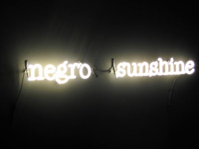
Schwendener on Brion Gysin

GYSIN-NewMu

Martha Schwendener at the New York Times takes a less jaundiced and judgmental view of Brion Gysin's life and work than did Artnet's Ben Davis. Her concluding paragraph:

The audience for magic was small during Gysin’s lifetime. But young artists skeptical of scientific rationalism — or whatever brand of theory they’ve been offered at art school — are finding Gysin’s approach alluring. Which is why, in a bout of art historical conjuration, his reputation as an “unsuccessful artist” is being overturned.

As a refudiation (thank you, Sarah Palin!) of Ben Davis's smug materialism this appeals but as noted earlier, Gysin "is not in need of debunking any more than he is in need of posthumous inflation." It doesn't matter whether the artists interested in Gysin are "young" or not, they only need be younger than Gysin (that is, alive) for his continuing influence to be noted.

The rather handsome photo of Brion Gysin's Dreamachine installation (as installed at the New Museum) by Naho Kabuta deserves a reality check in the form of this photo from the Internet of an earlier incarnation (in Bristol, England):

gysin_dreamachine_530

The New Museum tends to confer instant fabulousness on everything inside it but let's remember that the Dreamachine is something you experienced with eyes closed, so you could put it on top of an old tablecloth and it would still take you higher.

More coming on what some of what those younger-than-Gysin artists are doing with his imagery floating around the Net.
The New Google Images; Google vs GIFs; etc

1280423038940-dumpfm-timb-Picture-150

cartoon by timb posted to dump.fm

Clearly Google didn't consult Edward Tufte when it redesigned Google Images. Instead of the clean, spare search page Google is famous for the user must now navigate an image-crammed media adventure with more data than the brain can absorb, with involuntary popups that leap at you when you mouse over (unnecessary, distracting, and eye-fatiguing, with gratuitous drop shadows--it's the Apple-ization of all computing). Instead of less steps to click there are more. You have to toggle to see picture sizes--the default is "dimensions in popups only." When you get to the source page the background is greyed out and you have to click again to remove this design-heavy feature. There was nothing wrong with paging back through results--most people will stop at page 3 anyway. You don't need a giant, continuously loading page for every simple search.

And you still can't search for animated GIFs: you can select "GIF" but you have to type in the word "animated," making your search more cumbersome--why? (Don't know who at Google said they hadn't seen an animated GIF in ages (see above)--assuming it's true--but my guess is they'd like to phase out animated GIFs in favor of some hot new spec they favor--the way they are converting YouTubes over to the Steve Jobs video standard. People with the Chrome browser say it doesn't handle animated GIFs well.)

The image search has always been the most inept and random part of the Google search family. It relies too much on text descriptions posted on a page that hyperlinks to an image, without bothering to verify if the image has anything to do with the text. It seems to ignore whatever metadata or self-description the image itself has. In other words, Google gives priority to a page that has the word "Rotweiler" on it that links to an image of yours of a parakeet, even though you labeled the image "parakeet" and even though the "Rotweiler" page is talking about Rotweilers. Your self-labeling will be buried deep in search results assuming your image is picked up at all.

Instead of rethinking the functionality of the image search Google did what every big corporation does--made cosmetic changes to the package design and called it new and improved.

Three years ago the artist Marcin Ramocki did a series of portraits of individual bloggers based on their first 100 Google image results. They are mostly incoherent composites (or maybe we're just incoherent individuals--just kidding!). Ironically he stripped away the formatting and showed the images as a single long cluster of random adjacent tiles, which is exactly how the "new and improved" Google images displays images.

rotating color blob

1280447424457-dumpfm-stage-coloblob

by stage using animated screencaps of deluxepaint 2

deluxepaint 2 is a 20-year old paint program originally intended for Amiga computers. You can run it on a current PC using DOSbox (so I'm told--not sure I will have this level of dedication). Something I've been discussing with other artists since the time of the Infinite Fill show is the idea of older paint programs being aesthetically interesting, as opposed to just nostalgic. The people I was having that discussion with have all moved on to Photoshop but several people at dump.fm are interested in these issues.

screen shot of deluxepaint work space

another work space screen shot (link corrected)

full screen (tiled) piece made by stage with deluxepaint 2 motifs

four spheres made by stage

Cubist-style GIF