Jobs on Flash

Lauren Weinstein, Steve Jobs Posts Unconvincing Manifesto Against Adobe Flash:

Adobe was willing to do essentially all of the development work for Flash support, and Apple needed basically only to have permitted it onto the associated platforms. If users didn't want to use Flash (say, because they wanted a better touch interface or longer battery life -- two issues Steve discussed) nobody would put a gun to users' heads forcing them to use Flash anyway. An option to disable Flash could have been easily made available.

Yeah, USER CHOICE!

Clearly, the real problem that Steve Jobs has with Flash is that someone other than Apple has control over it. And the guiding principle of the iPhone/iPod/iPad ecosystem is Apple Controls All.

Sorry Steve. Nice try. Well written. But it just doesn't fly.

The silly rhetoric we keep hearing about Apple leaving the past behind (by, say, restoring books to 19th Century levels of uncopyability?) comes from Jobs himself. The fish rots from the head.

Update: Just received a complaint that this is a defense of Flash. There are probably as many gripes about Adobe on this blog (and its predecessor) as there are jabs at Apple. Suggesting that Sauron should give Saruman's followers a break is not the same as saying you love Saruman.
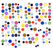
Static on Static

92868759

Twitpic from Jon Williams aka Wizardishungry.

As if mind-reading Williams posted the above while a previous post here about jpeg noise and Sigmar Polke enlarging newsprint grain was being written. The assessment of whether a particular kind of compression noise could be interesting had to be changed from "never" to "rarely."

The image above seduces by melding two types of noise: a moire pattern reminiscent of the analog static of a TV transmission and the artifacts of saving and resizing digital video. The patterning is happening on two levels and to the extent it's possible for quantization noise to swirl that is happening here.

So, swirls within swirls in an intricate dance--antiform becomes content. The swimming pool algae color enhances the strangeness.

Just so it's clear, bad jpegs can be sublime--we were talking about a particular type of resizing noise that mars areas of solid color, usually looks bad, and is generally too omnipresent to be interesting.

Update: Am reminded that the precise term is quantization noise--originally had it as bicubic mush.

Update 2: Williams informs me that there is no analog in this--the moire pattern is also digitally made but reminded me of TV static. Corrections were made to the post.

de-enhanced sigmar polke re-enhanced

historyii_450

Everyone loves that scene in Blade Runner where Harrison Ford scans in on the polaroid image while drinking scotch, even though the segment's rife with continuity errors and anyone who's used Photoshop knows enlarging mush just gives you bigger mush. Above is a Sigmar Polke grid from google images that has been enlarged, brightened, sharpened and de-yellowed. Some new content is revealed but no snake-woman in the mirror. (Maybe if we keep zooming...)

Polke made a career of enlarging newspaper photo grain but it remains to be seen if that can be done with bicubic quantization noise from a distressed jpeg (some of which can be seen in the upper left panel). Only rarely does it look good. According to the filename the title of this grid is "history ii." No history is complete without spanking (barely visible in the pre-Harrisonized version). Even at these dubious resolutions Polke has an exquisite eye (but not too exquisite).

When they're not breaking down doors they're installing them

Steven Berlin Johnson notes that you can't copy and paste text from the Apple iPad's iBook application. You can highlight it...

6a00d8345166f269e20133ece23

but then all you can do is "bookmark" it:

you can’t actually copy the text, to paste it into your own private commonplace book, or email it to a friend, or blog about it. And of course there’s no way to link to it. What’s worse: the book in question is Penguin's edition of Darwin’s Descent of Man, which is in the public domain. Those are our words on that screen. We have a right to them. [hyperlink, emphasis added]

With the "NY Times Editor’s Choice iPad app" (yuck) you can't even select, Johnson notes--it's just a frozen screen of words.

You just have to laugh, hard, when people say Apple is "moving us forward" or "moving computing into the next generation."

[hat tip ED]