Time Out New York reviewlet:
Marvelli Gallery
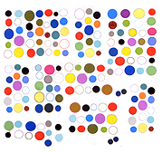
Skyler Brickley, “Wall-to-Wall”
The digital is rendered with a gestural touch in these large-scale paintings, which, hung together, constitute a chromatic environment within the gallery.
Two missing words: Andy Warhol. But seriously, these paintings grow on you after you stand in the gallery a while. Two artists from Texas, John Pomara and Tad Griffin, have done similar work: their paintings have more tasty and considered surfaces but don't attempt the ambitious wraparound environment Brickley's show does. Not sure how much "the digital" really has to do with this project--it could refer just as much to xerography and Muybridge. Possibly there's something in the back story of the artist's process but it seems more likely the reviewer wants to make the work sound current by invoking 0s and 1s, even though this is old fashioned smeared/squeegeed paint on canvas. (Some screen printing might be involved--would have to delve into it more--but nothing resembling ink jet or other digital printing a la Guyton/Walker.)
