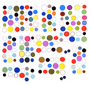


Spent a day remaking some old posts that were altered by the blog's new format and/or changing browser specs. It's one thing to say, "the web interprets code as it will, man," and quite another to see a fairly straightforward idea wrecked by someone trying to idiot-proof all users' experience. There is a distinction between being mad at "the web" (pointless) vs being mad at individual designers who happen to have a bad idea (whose minds might be changed through constant ridicule).
Matt Smear made a GIF I posted a while back showing how the grid above was being read in an RSS reader. Made a slight design tweak and am curious how impervious it renders this to good taste, so am reposting.
Also redone were enlargements of Charles Westerman's shrinkages of a couple of earlier GIFs, and this layered molecule animation. Folks with Macs (the "smooth jazz" of computers) will get to see these works for the first time--woo, yay.
Update: Ha, well bloglines reads the above GIF array now as a solid rectangle blinking red and orange. Not really an improvement over evenly spaced stripes, since it is the intervals that would seem to be the point here. "We don't do intervals."
Update 2: Not to overdo the self-exigesis but there are also horizontal intervals here: the lightning-like irregular arcs that crackle across the grid when the browser attempts to transition simultaneously all the (identical) vertical stripe color changes. This behavior will change across browsers.
