Not Really So Beyond As All That

An earlier post made fun of the Whitney Museum's blurb for its Dan Graham show catalog:

"Dan Graham has always pointed beyond in his work: beyond the art object, beyond the studio, beyond the medium, beyond the gallery, beyond the self. Beyond all these categories and into the realm of the social, the public, the democratic, the mass produced, the architectural, the anarchic, and the humorous."

In response I said:

The pounding rhythm and faulty parallelism amuse, but also epitomize the kind of priestly incantation spoken or sung over contemporary art. We must be assured and soothed that every market player in the art world is in fact anti-object and anti-gallery, a selfless Walt Whitman-like figure that embraces, nay, merges, with the democratic mass, doing good works over a lifetime of artistic philanthropy.

Having now seen the show it can be officially declared what a crock all those "beyonds" are. It's a fine, thoughtful exhibit but it's about as "beyond" as a prison inmate who rarely leaves his cell and instead creates a body of work imagining all the permutations of his cell walls and his thoughts about those walls. Yes, yes, Graham photographed some tract houses in New Jersey in the '60s, but the show is centered around a series of gallery-like spaces with 1- and 2-way mirrors and cameras that seem more like devices for surveillance and stalking of gallery visitors than eyes exploring the world outside ("I'm looking at this woman through my viewfinder and describing to you her nude body while she watches me on TV and describes mine"). Graham's show is a meditation on wall labels, documentation of artwork, an artist talking about his own art, and the architecture of galleries and sculpture gardens. There are exceptions, such as Graham's documentary films about rock and roll, but one of the more telling statements about the show's commitment to the outside world is Graham's written observation, in a text piece listing examples of art and architecture he likes, that he admires Larry Bell's use of plexiglas but wishes it didn't have any color. Tacky colored plexiglas is precisely what the world beyond the art world looks like.
browser emulators?

In response to my previous post about old GIF posts being FUBAR'd by current browsers with mandatory anti-aliasing or smoothing features, S. R. emailed wondering if the solution might be "an emulator on the server side, that forces rendering of any number of pages/urls that the designer wishes, to any number of possible browsers/versions." I have heard talk of such but replied thusly:

I don't have a problem with web standards being a consensus and artists working within that consensus. Unfortunately the consensual notion of progress in this case was that Safari-style anti-aliasing was the right way to go. But now I've lost and I represent the crank fringe. My guess is web professionals have enough worries without having to accommodate every crank fringer that's out there. Having a grab bag of different browser settings on servers is thoughtful but not very elegant. How many nutty settings need to be accommodated? Who decides? Eventually you have to have a Wikipedia style vetting process.
It's easier for me to change a few GIFs than agitate for broader change in this case (except for occasional griping).

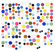
"pixel monster - faier" by pixelthork, 2004

am embarking on a project to save some GIFs I posted on the old blog that can no longer be read correctly in any current browser. long story short, html commands to enlarge a small GIF to specified dimensions no longer result in an "as is" enlargement--the browser assumes you want it tastefully fuzzed out. this used to be the case only with the hideous Mac Safari but the infection has spread to Firefox 3 and IE 8. The above GIF from deviantart.com (the old link no longer works) was originally much tinier, I did the enlargement and thought I was done with it back in '04. More of these to come. (I had to use Seamonkey to even find a browser that would read it so I could do this screen capture. Fetish much?)

hard sell returns to the web

Next time you come to this page your entire screen will become dark and a little man on video will appear and start talking to you really loudly as you desperately hunt for the X to turn him off. Just kidding, this blog wouldn't do something like that, we're not media vulgarians here. For a while it seemed things had settled down with annoying pop-ups, after the dot com era, when failed businesses were soul searching and consultants told them consumers were turned off by these distractions from content. With the gradual "improvements" in streaming media and the ubiquity of Flash players in browsers, the wisdom now seems to be, "Yeah but we'll make our pop-ups so entertaining people will like them."

Josh Marshall's ever-worsening blog, sorry, news portal, now features video ad pop-ups that roam around your screen.

Of course pop-ups never went away on the cruder sites, they just became less of a pain as blockers became standard issue in browsers. We're talking here about the media brahmins who kept their temples austere for as long as they could but are gradually resorting to carnival barkerdom as times get tough. Only the low-overhead solo shops can afford to stay bland, elegant, and gimcrack-free.

[edited slightly since initial posting]