Don't really expect anyone to share my sense of tragedy about being forced to live in a smooth, anti-aliased Steve Jobs kind of world while surfing the web. But you can't stop the complaints from this page.
Sorry, there is a difference between Zen-like acceptance of conditions as they are ("a million computers interpreting things a million ways, man") and letting some Adobe-addled web designer shove his or her bad ideas up your crack. And having that be the *only* choice.
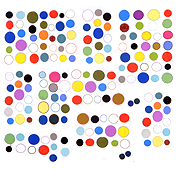
Case in point, let's consider what said web designer did to Charles Westerman's enlarged GIF [update, 2016: reposted here].
Viewed in Firefox 2, it's as seductive as an Ellsworth Kelly painting. [screen shot of moving image - a fleet, fast-loading 23 KB .png!]
Viewed in Firefox 3 (or on a Mac) it looks like a student just discovered the blur effect in Photoshop (and did nothing else to the image). [screen shot of moving image - a bloated 388 KB .png because it now has those "tasteful" interpolated gradients!]
If that's just random chance, fine. But it's a decision made by humans (to give your browser "zoom" capability for entire pages including images and not just text) and it's the taste of humans and that is not a force of nature. It can be ridiculed!
This isn't just a plea for designers to respect web artists' pet "lo fi" projects. There is a difference between rendering photos and rendering graphics. Making photography the default norm for the web is wasteful and unecological and part of our corporate masters' project to turn the web into TV so they can sell us more shit (and still fail in business).
