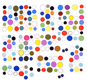
From the Robert Wodzinski/pngmess flickr page.
Another screen capture example, with the brevity and clarity of a Paul Feeley '60s color field painting and the texture of tie-dyed fabric but you know it's a fragment of something: the red/green seam suggests a photoshoppy blurring.
This image needs a white space around it to work.
Update: Written in the style of Roger Fry, who described God, in a Renaissance painting he was lecturing about, as the "dominant central mass."
Update 2: The capture improves google's "arty" new favicon, which tries to be Miro but looks more like Sister Mary Corita, by giving it the Uta Barth treatment. That said, captures generally fare better as art when the references aren't topical or something to be "gotten" (or not gotten, in my case, before Paddy Johnson pointed out what it was).
