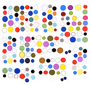
Discussing "chord equivalents" in visual art with TH by email on Christmas.
Kandinsky and the Bauhaus covered some of this but not sure how much attention it's gotten lately.
"Palettes" would be the equivalent of scales: pentatonic, diatonic, etc.--the note universe or family of a given work.
Thus in computer graphics, the MSPaint palette is 16 color hexadecimal, but you could also have kid pix & mario paint palettes (hat tip Travis Hallenbeck) or Photoshop.
Whereas, "chords" would be, e.g., red-white-blue (the USA PATRIOT chord--ugh), yellow ochre and orange (a two note chord--Southwest Airlines), etc.
The "Southwest Airlines chord" is no more absurd than saying "the harmonic seventh chord is also widely used in 'blues flavored' music" or, better, "the tonic is the note of the scale that is considered the most important." (quotes from Wikipedia)
The musical statements are claimed to have mathematical certainty based on pitch and harmonic relations but it's really as entirely subjective as would be saying that ochre is the "key" to the Southwest Airlines color scheme.
I know this isn't an original thought--12-tone music was based on a critique of pitch hierarchies. But I think in visual art people stopped prioritizing colors sometime around the Enlightenment whereas in "western music" pitches, chords, and modes continue to be microanalyzed, ranked, and named to an insane extent.
For example (more Wikipedia), consider scale degrees:
in English, [they are known] by the names tonic, supertonic, mediant, subdominant, dominant, submediant, leading tone.
These names are derived from a scheme where the tonic note is the 'center'. Supertonic and subtonic are, respectively, one step above and one step below the tonic; mediant and submediant are each a third above and below the tonic, and dominant and subdominant are a fifth above and below the tonic.
Translating this into visual terms:
"In the 'US flag color scheme' red is at the center and therefore the tonic; white is the supertonic and blue is the mediant."
That's just silly but the same types of statements are not considered silly by music pedants.
For the record, I know that visual art has theories of complementary colors, the golden section, etc. It's just that they are rules of thumb, learned in first year studio classes and then basically non-issues. It's really chord theory, and its lack of a counterpart in painting, that's perplexing me this holiday season.


