last sculpture post for now

gutnov_et_al

Above, another image from the wannes deprez/ony one flickr stream: A. Gutnov, V. Iudintsev, E. Rusakov, Scheme for a tower on Trubnaia Square, Moscow, 1970. This looks like something from the 1920s rather than 50 years later. More of that crazy Soviet-era architecture that's gradually getting wider views thanks to the WWW.

stanfield13

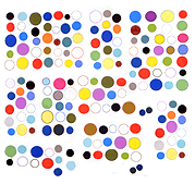
Completely unrelated except in some vague rhythmic sense, a neo-Rauschenbergian photo-combine by Roy Stanfield. (Actually it's way more elegant than anything Bob ever did.) From Stanfield's website, which is now a daily, single image archive. He also designs artist and gallery websites, so throw him some business.
Mostly Sculpture Exhibition in China

Below, a sculpture exhibition at the Median Art Center in China, photo by Kai Vierstra from his blog. Click image for larger view. His sculpture is the helix of wooden triangles just to the left of center. One thing that intrigues here is the commitment of indoor acreage to art and the predominance of abstraction in the work. Not one image of say, ironic Mao-era socialist realism to give the show figurative "balance" (with the possible exception of the painting up near the ceiling--can't see it very well).

vierstra_china52

L.M. Sums Up the Last Three Years of Good Web Art

Lorna Mills (aka L.M. from the Sally McKay and L.M. blog) is teaching a net art class and has published her class notes. It is a mix of syllabus, lesson plan, and how-to with much editorializing and distinction-making about the current scene of surf clubs, web art 2.0, or what have you.

Rather than embrace the Web Establishment with links to textbook examples of net art, Mills is marching off into the great uncharted and taking impressionable minds with her.

Subjects covered are things yours truly has been going on about for years and were only barely adequately covered at the Net Aesthetics 2.0 panels and subsequent discussions with Rhizome chatboard naysayers. Collections, arranging GIFs on pages, using tables, distorting GIFs, YouTube hacking, hackers vs defaults, Nasty Nets, Double Happiness, Chris Ashley, Loshadka, Petra Cortright. The good stuff.

Daniel Widrig and Shajay Booshan

widrig_booshan

binaural, a sound-based data sculpture by Shajay Bhooshan and Daniel Widrig commissioned by Melkweg

Frozen: Sound as Space exhibition, Amsterdam, July 2008, curated by Marius Watz.

Haven't seen the piece, only jpegs from various angles. These sculpture posts are more in the nature of thought experiments than art reviews. What do the images of the sculptures say to a working artist? Would like to see this piece/image have some of the obsessive/creepy personalization of say, Cathy de Monchaux, or the sense of accident or catastrophe of the Kai Vierstra Earthquake piece posted earlier. The idea of sound visualized as pure form is nice and the execution is tight but art is more than that. This is a complaint about generative art generally. Even though the computerization tools are new, we've been there with this kind of modernist sculpture. At its worst it's a kind of kitsch that you saw a lot of in "happenin" '60s/'70s churches and synagogues. At its best it does exactly what it's supposed to do--visualizes sound waves, in the most formally pristine way. Again, we need more.