Have been reading the Timothy Alan Liu book Rob Myers recommended, The Laws of Cool. Especially liked the discussion of the history of typefaces and design as they made the jump from print to the web. The book features a good, if matter-of-fact, discussion of JODI, as well.
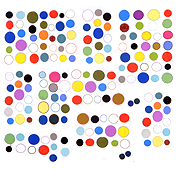
This blog confesses it has a hard time finding its place in Liu's scheme for some of the reasons Rob mentioned in his post on the artwork here (thanks--much appreciated): "...it would fail as simple web illustration. It is too interesting and has too much internal complexity. It makes a context for itself. History, problem solving and interiority are anathema to the easy post-historical consumerist cool of Web 2.0."
Alan Liu assumes everything is about "cool" and eventually even the "uncool" gets absorbed into the "cool." That is, the computerized workplace and playplace is an all-encompassing seductive experience measured in "cool," whether it's the Ars Electronica avant garde or designers creating Facebook apps.
I'm interested in seeing software and web tools made problematic through the investment of time and labor all out of proportion to their intended function. Examples would be hand-shading a gradient instead of just writing parameters for it, or hand-rendering animation frames without any use of onion-skinning or digitally generated transition frames. This is an artist stance of "doing the difficult thing" which does not make an easy jump to the web.
The labor and use of "historical" art techniques is not always conspicuous in the finished product (that is, my artwork), so Rob's vouching for it is appreciated.
A post on Rob a few years ago and some examples of his online artwork are here. We have an ongoing disagreement over whether the surf clubs "add anything" to the images they recycle.
Update: Don't know where that "Timothy" came from. Most uncool.
